Exercise - Using Black and White
I have thought about an illustration to create that is black and white. I want it to be dynamic once I have filled in the areas of black and white paper as directed in the exercise.
I decided on a Anglia fish such as the photo below:
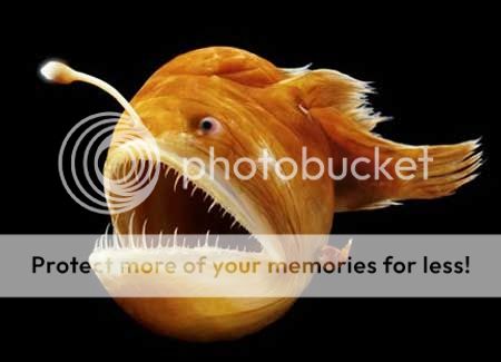
They are quite scary looking and they have a light in there head to draw there pray. They live in deep waters. I want to use this idea to make a good illustration with the use of light.
Here is my illustration below:

I have scanned it in to the computer and printed a copy off in negative colours. I attempted with this but decided that I should use black paper as a base and build up on there with my other shades. I may need to also add more black areas on the top , bur I will check this out as I am doing it.

I think it has come out great and the use of black, grey and white has helped a lot to enhance the scene.


Above is my image of what I created. I think it looked really well and it goes well for the next part what I did.


I have started arranging the pieces and have decided to use some grey paper. I feel I need at least 3 tones to create my scene.
After arranging it and gluing it together here below is the scene I made:

I decided awards that I needed to clear my my image so I put it in Photoshop and cleaned it up. I removed lines of areas you could see that I stuck together. I used the spot tool and went over it to remove some glue marks:

I think helped improve my work and made my image more clearer.
Comparing my tonal image to my line drawing:
Black and white has altered my line image by adding more depth in to my scene.The black background adsorbs you in to darkness, which is what I was after. The eyes in the darkness now stand out, with the eyes white from the light from the mean fish.
The focus in my line drawing is the mean fish but in the black and white one, the little fish is more prominent with the spotlight helping him to standing out. I have added some white and black areas nn top of the grey areas to show the source of light reflecting off these areas to make it more dynamic.
Other illustrators work which is described as graphic:
Some illustrators below to keep not of who do graphic black and white illustrations:
Rohan Eason
Images below from: http://www.illustrationweb.com/artists/RohanEason/view

Above - I really like this idea and it really makes a dramatic scene with the shadows created.

Even though this scene above has a little yellow bird the majority of it is black and white. I am not to sure if you can count this as a graphic but I just wanted to show how much a singe object of colour in a black and white scene really stands out.

Above - At first you see the foreground as just bushes but then looking closer it is actually scary monsters looking like there getting ready to scare a girl. I think this is very cleverly done how he has made this illustration. The main feature is the house and the child surrounded by the darkness of the creatures.

Above- This is a black and white perspective that I thought was really well done. It shows a path with haunted trees surrounding it that leads to building which is the focal point.
I want to just talk about the mark making of this illustrator. I really like his work, his marks and the way which he uses inks and fine liners works really well. I need to do some experimenting with black ant white more, as I do find this type of work interesting. People say black and white is old fashioned but when there is so much texture and a good scene, then I think they are actually really cool to look at.
Dourone
All images below from - http://www.illustrationweb.com/artists/Dourone/view

Above - This is a real detailed black and white image of a stage. the whiter areas around the stacg from the background makes the stage stand out and becomes the main focal point in the illustration. Here the has used a lot of different marks to capture the scene.

Above - I really like the marks here used to create an illustration on a bus. This is a very objective graphic type illustration.

Above - Using the same type of marks he has used with the bus, he has also drawn a man which is also effective.
I like this guys work, not as much as Rohans, due to the more childlike scenes but he has a great talent and his mark making is the thing I am interested in here the most. It is really neat and details and when I have a free moment I shall give this a go.
Kuretake Job Interview - Fish
Recently I had a great opportunity for a job interview. It was a company called Kuretake who manufacture art supplies based in Reddich. They wanted someone to become a craft assistant and create items and illustrations with there stationary. I applied for the job and gt an interview. It went really well and they asked me to come back for a second interview. For the second interview I needed to go back with a presentation showing using there items to make an illustration.
I did a bit of research and decided to do an illustration of a fish.
I quickly sketched out a rough idea below;

I brought some of there items which was dipped ink and some watercolour brush pens.
I decided to do the outline of my fish with the black ink with a dipped pen. I started it but my dipped pen nib was a bit wobbley and made a big drip on my paper. I was a bit gutted at first but then I decided to go on with it. My dipped pen kept dripping and I decided every time it dripped to hold the page up to let it drop down the page.
It actually started to look really good and it worked well with the fish. It created a splash effect which worked well with my illustration.


I then needed to colour it in using there water brush pens:


As you can see above this was my final illustration I created. I was so happy with my outcome and I am glad I carried on with the dripping ink.
I also created a leaflet in photo shop to advertise there pens:

I did a really good presentation and I did as bet as I could.
However I didn't get the job in the end but it was a great experience to see how far I could get. I think what lacked we my experience with photoshop. They wanted some one who could use the program well, where as I am only learning. It was a great opportunity and I got a good illustration out of it to keep.
Getting ready for Christmas Craft Fair
I am going to a craft fair in Birmingham in December and wanted to sell a few creative things. I decided to have a go at painting some natural objects such as logs and stones:


Above - characters I made on my log slices. I made the polar bear stand out a bit by using cardboard for the head and arm to add some depth.

Above - I also had a go at painting on stones which was fun.

I enjoyed today experimenting and I like my ideas that I created. It was just to test some ideas out to see how good they looked. I like the bark paintings the most and when I have some more free time I will do some more. I want to also try creating wrapping paper gift tags, Christmas cards and do my illustrations on them.
No comments:
Post a Comment