Sunday, 2 October 2016

ASS2 - Project 6 - Choosing Content

Exercise - Choosing Content

Read the following extract and then answer the questions below: 

'The room was void and unquickened; it was like a room in a shop window but larger and emptier; and the middle-aged man who sat at the desk had never thought to impress himself upon what he entered every day. Comfort there was none nor discomfort; only did the occupant deign to qualify the pure neutrality of his surroundings, it would surely be austerity that would emerge. The spring sunshine turned bleak and functional as it passed the plate glass of the tall-uncurtained windows. The windows were large; the big desk lay islanded in a creeping parallelogram of light; across this and before the eyes of the man sitting motionless passed slantwise and slowly a massive shaft of shadow. Perhaps twenty times it passed to and fro, as if outside some great joy wheel oscillating idly in a derelict amusement park. And the man rose, clasped hands behind him and walked to a window – high up in New Scotland Yard. He looked out and war-time London lay beneath… on his brow was a fixed contraction; this he had carried from desk to window, and now there was neither hardening nor relaxation as he looked out… during 15 years he had controlled the file of police papers which dealt with the abduction and subsequent history of feeble minded girls. Here lay his anger as he looked out over London... year by year the anger had burst deeper until it was now the innermost principle of the man. '

Michael Innes Adapted from The Daffodil Affair 

If this were to be made into a film what would the main character be like?

     The main character would be a gentleman who is an inspector. like Sherlock Holmes. His missions in life are to solve crimes and keep peace in the city. He is a deep thinker and some one that is very wise and has see a lot in his life of murders and crimes.

What clothes would the character be wearing?

  A suit, a tie - which he has loosened up from a stressful hard day. He smokes and drinks a bit of whisky, not too much but to take the edge away of his type of job.

What furniture is in the main area in which the action takes place?

There is a desk and windows with curtains - the room is dark and mostly empty which emphasis him with his dark thoughts of evil people on the streets.


Visual Reference:

Here below is some images I thought were idealistic of what I wanted to convay through my character.


     The scene has a darkness mood to it with mystery and it reminded me on the film 'Sin City' (some images above). )It was a really dark film, with thoughts of how to protect people.


Above is some old classic detectives I found. Even Detective Noir is in there as He fits the character well.


    Above - I am a fan for any mystery dramas my favourite is Sherlock Holmes and Inspector Morse. I love the dark hidden secrets and I enjoy trying to solve the mystery before the detectives do. I went to Sherlock's house early this year in London, with my Fiance -  221b Bakers street is was a great experience. Hears some pics below to help to inspire me for my character.


Mood Board Word : Mystery

      Here below is my mood board I have just finished is isbased on the word Mystery on solving crime and finding the bad guys. I think this set me up great with my character as he is a detective but the pharagragh does not give much away about the main characheter. I get the impression that he is a man who has seen a lot and the main character him self is a bit of a mystery.


      Above - For my mood board I have chosen colours such as brown red and black  - these three colours remind me of a crime. I have used yellow paper and stamped in with letters to make it look like police tape. I have put pieces of flower material and beads to look like a necklace to show maybe a woman was involved in the crime. I used my finger in red ink to show finger prints. I feel I have captured the word mystery well. 


My Character portrait:

     From the information I collected, I sketched out a character. I wanted him to be late 40s wearing a brown suit. I wanted him to have wrinkles of tiredness, to show his stress from his job role.

Here is my sketch:


    I decided for this exercise I was going to try using Photoshop. I decided just to go with it and see what out come I make.

First of all with my tablet I sketched out my out line from my original drawing.:


     I then Painted him in with a spray brush nib and used different tones of colour to make there light coming from the right:


   Here below is my image now with my previous sketched lines:


    I am so happy with my out come for a first real go at Photoshop, it's not actually that bad. My character looks just like I pictured him to be.

     Next I decided on the background. I wanted to keep it simple and some how make my character stand out.

I decided on dark blue and discovered a tool, which helped me create a glow around my character.


    I think the background looks really good. I wanted to keep it simple for the view to wonder how this man is.

Here is my finished image below:


I am really happy with my outcome its better then I thought it would of been. I like the paint style which I have made. He looks as how I would visualise him.

I also just tried to see if it would of been better in a black and white  tones with a hint of colour just like 'Sin City' Film.:


I think this works well too, and gives it that old age sense to the illustration.

Overall:

     This has been a good exercise to see how my character was developed. From reading the paragraph, then researching and then creating. This process makes you think and imagine the character you want better. It makes the character more real and helps put their personality in to the illustration. Doing a mood board helps capture the atmosphere on the scene and put it all together create an illustration which works. I think my character comes across as mysterious and has a detective look to him.

ASS2 - Project 5 - Black and White

Exercise - Using Black and White

     I have thought about an illustration to create that is black and white. I want it to be dynamic once I have filled in the areas of black and white paper as directed in the exercise.

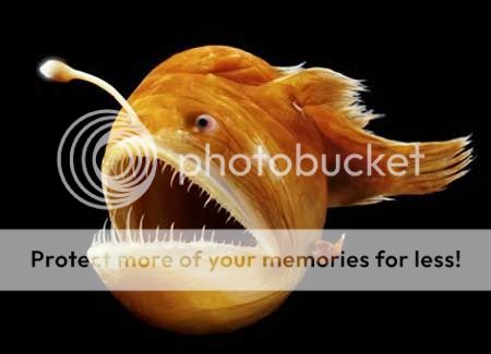
I decided on a Anglia fish such as the photo below:

Image result for male angler fish attached to female

    They are quite scary looking and they have a light in there head to draw there pray. They live in deep waters. I want to use this idea to make a good illustration with the use of light.

Here is my illustration below:


    I really like my idea and I think it will look great when I make parts black.

    I have scanned it in to the computer and printed a copy off in negative colours. I attempted with this but decided that I should use black paper as a base and build up on there with my other shades. I may need to also add more black areas on the top , bur I will check this out as I am doing it.

    I have started arranging the pieces and have decided to use some grey paper. I feel I need at least 3 tones to create my scene. 

     After arranging it and gluing it together  here below is the scene I made:


      I think it has come out great and the use of black, grey and white has helped a lot to enhance the scene.

  I decided awards that I needed to clear my my image so I put it in Photoshop and cleaned it up. I removed lines of areas you could see that I stuck together. I used the spot tool and went over it to remove some glue marks:


  I think helped improve my work and made my image more clearer.

Comparing my tonal image to my line drawing:

     Black and white has altered my line image by adding more depth in to my scene.The black background adsorbs you in to darkness, which is what I was after. The eyes in the darkness now stand out, with the eyes white from the light from the mean fish.
     The focus in my line drawing is the mean fish but in the black and white one, the little fish is more prominent with the spotlight helping him to standing out. I have added some white and black areas nn top of the grey areas to show the source of light reflecting off these areas to make it more dynamic.

Other illustrators work which is described as graphic: 

Some illustrators below to keep not of who do graphic black and white illustrations:

Rohan Eason
Images below from: http://www.illustrationweb.com/artists/RohanEason/view

Above - I really like this idea and it really makes a dramatic scene with the shadows created.


      Even though this scene above has a little yellow bird the majority of it is black and white. I am not to sure if you can count this as a graphic but I just wanted to show how much a singe object of colour in a black and white scene really stands out.  

     Above - At first you see the foreground as just bushes but then looking closer it is actually scary monsters looking like there getting ready to scare a girl. I think this is very cleverly done how he has made this illustration. The main feature is the house and the child surrounded by the darkness of the creatures.


     Above- This is a black and white perspective that I thought was really well done. It shows a path with haunted trees surrounding it that leads to building which is the focal point.

I want to just talk about the mark making of this illustrator. I really like his work, his marks and the way which he uses inks and fine liners works really well. I need to do some experimenting with black ant white more, as I do find this type of work interesting. People say black and white is old fashioned but when there is so much texture and a good scene, then I think they are actually really cool to look at.

Dourone
All images below from - http://www.illustrationweb.com/artists/Dourone/view

Above - This is a real detailed black and  white image of a stage. the whiter areas around the stacg from the background makes the stage stand out and becomes the main focal point in the illustration. Here the has used a lot of different marks to capture the scene.


Above - I really like the marks here used to create an illustration on a bus. This is a very objective graphic type illustration.

Above - Using the same type of marks he has used with the bus, he has also drawn a man which is also effective. 

    I like this guys work, not as much as Rohans, due to the more childlike scenes but he has a great talent and his mark making is the thing I am interested in here the most. It is really neat and details and when I have a free moment I shall give this a go.

Kuretake Job Interview - Fish

     Recently I had a great opportunity for a job interview. It was a company called Kuretake who manufacture art supplies based in Reddich. They wanted someone to become a craft assistant and create items and illustrations with there stationary. I applied for the job and gt an interview. It went really well and they asked me to come back for a second interview. For the second interview I needed to go back with a presentation showing using there items to make an illustration. 

I did a bit of research and decided to do an illustration of a fish.

I quickly sketched out a rough idea below;


   I brought some of there items which was dipped ink and some watercolour brush pens.

  I decided to do the outline of my fish with the black ink with a dipped pen. I started it but my dipped pen nib was a bit wobbley and made a big drip on my paper. I was a bit gutted at first but then I decided to go on with it. My dipped pen kept dripping and I decided every time it dripped to hold the page up to let it drop down the page.

It actually started to look really good and it worked well with the fish. It created a splash  effect which worked well with my illustration.


   Above is my image of what I created. I think it looked really well and it goes well for the next part what I did.

I then needed to colour it in using there water brush pens:


     As you can see above this was my final illustration I created. I was so happy with my outcome and I am glad I carried on with the dripping ink.

I also created a leaflet in photo shop to advertise there pens:

I did a really good presentation and I did as bet as I could. 

      However I didn't get the job in the end but it was a great experience to see how far I could get. I think what lacked we my experience with photoshop. They wanted some one who could use the program well, where as I am only learning. It was a great opportunity and I got a good illustration out of it to keep.

Getting ready for Christmas Craft Fair


          I am going to a craft fair in Birmingham in December and wanted to sell a few creative things. I decided to have a go at painting some natural objects such as logs and stones:


      Above - characters I made on my log slices. I made the polar bear stand out a bit by using cardboard for the head and arm to add some depth.


Above - I also had a go at painting on stones which was fun.


        I enjoyed today experimenting and I like my ideas that I created. It was just to test some ideas out to see how good they looked. I like the bark paintings the most and when I have some more free time I will do some more. I want to also try creating wrapping paper gift tags, Christmas cards and do my illustrations on them.

ASS2 - Project 4 - Creative Thinking and problem solving

Exercise - Objective Drawing

     I decided for this task to draw my favorite umbrella. I t is Mary Poppins replica umbrella which my Nan got me when we went to see Mary Poppins at the theater early this year.

I firstly got my umbrella in fornt of me and did a spider diagram to describe it:


I then put my umberlla in various  angles and quiklety stetched it out:


    I decided I like to draw it when the umbrella was closed as it whats the aspects that I like about my umbrella.

   I am now going to begin my main illustration an look carefully at my umbrella to capture what I observe. I have decided to illustrate in on nice brown card as I think it will enhance my lines of the umbrella.


    As you can see above, this is my Illustration of my umbrella I have sketched. I am really happy with it. I used fine liner for the out lines and a white pastel pencil to create highlights where light was reflecting from the window in my art room. I think I have drawn it very accurately. Maybe it does need to be a bit taller. I feel it may look a bit squashed on my card  length ways, but I tried my best to get the overall proportions right. 

I think this is a good objective drawing of my umbrella. 

Newhampton Art Gallery event

     Today I went to an event where people had gone around Wolverhampton and painted, illustrated and in any way they could capture areas of there home town.

They then had there art work put up in the Newhampton Art Gallery and people could vote for there favorite artwork. The winner would receive £100.00

Here are some of  the ones I liked the best and why:


Above - I liked the style the artist has used. He has used water color washes and then used a fine liner to draw his illustration of an area near his home,


Above - Again I am really enjoying looking at peoples art who has used lines and observed a certain building they admire.


Above - This painting is very different, they have used water colours in a controlled way to create textures of the items in his landscape he was looking at. The colours remind me of autumn and the contrast against the rocks and pathway work well.


Above -  This was my favorite art work from the event. it was painted on a board that was a bit battered but once he painted his art it added character to his work. his lines are really straight and I really like his illustration of a man and the bouncy toy. There are simple colours used nd overall he has created a unique piece of work.

     I voted for his work and a few hours later I had a call to say my name had been picked out of the voters and I won two theater tickets. I never win anything so it was a nice surprise and was a good day. 


Volunteering for NAF arts and National trust 

    This month I have volunteered for to places where it will help me with my creative ideas. The NAF is a group that hold art events for people in Norfield in Birmingham. I was helping to get younger children in to art and crafts. I am waiting to her off them to start doing it monthly and see what happens. it was a good experience and some good inspiration for then young ones. 

   I also went volunteering for the National Trust and was a good day of cleaning up a park. It was not very creative but the lady called Dee who ran it said that they  will be event days such as making baskets from twigs etc that I could get involved in and she is going to keep me posted. 

Arches project

   The Arches Project is run by a lady called Evett. She looks at artists who are trying to enter the art word and helps to promote them and push them in the right direction. I went to see her and she is a good contact to keep for when \I feel ready to put my work out there.I told her about my children's art etc. and she was interested and said I could put some of my work in her gallery space once I have some pieces to show her. 


Exercise A Subjective Drawings

A Subjective drawing is looking at an object and creating an idea based around it. I have decided on a brush and decided to show each texture of my object.

I first did a mood board below:


    I looked at parts of my brush and found items I could use to form my brush.

    For the bristles of my brush I found Items such as hay, wool, washing up sponge, images of hair and grass and some thick string.

    For the metal area of the brush, I found things that were shiny such as foil, shiny paper and sequins.

      For thew handle of my brush I decided on plastic items such as carrier bag, cling film and plastic packaging.

I then arranged them and glued then on a sheet of paper:


     For the background it is stripped in to three parts to show the texture through out the object: bristly, shiny and plastic.

Overall the out come was interesting. It gave me a good understanding of how I observe Items and I can see that what I had created is like a mind spider diagram to how I store the memory of the brush in my head.

Day out at Custard Factory

     Yesterday I went for a afternoon/evening night out with my partner, Carmen and our friend Tom. I decided to take a few photos that were inspiring and Good things to keep noted:


Above - An interesting oil can left in the road, I felt it was very interesting to look at and is a piece of art on its own.


Above - A galaxy graffiti, I luked the use of colours and stars.


Above - A geometric Tiger. I was quite impressed with the artists skills here.

Below - A few more graffiti parts that I found worth a photo: 


      We recently found out that graffiti artist have there own logos, or if there in a group they have a crew logo. They create stickers of there logos and put them on lamp-posts in areas they have been and graffiti. We met a guy called Moes and he is a well know graffiti artist in the area. Instead of stickers he had his iconic illustration of mushrooms turned in to magnets and he would stick these on to lamp-posts so if people find them that can take them home with them and put them on there fridge. 

     On the evening we were walking back to the car and we spotted all up the road his mushrooms on the lamp-posts as we passes, so we collected them hears a picture below:

Above - Me, Tom and Carmen

       What I love about this is that general people would not blink at looking at dirty stickers on a lamp-post. They would not even recognise that these lovely, cool magnets were right in front of there noses and I really like that Idea. Its quite special. Is like finding a little arty treasure. 

Drawing of a pet dog

A friend of mine asked me today to draw his dog so here is my attempt below:


     It was one of my friends favourite photos of his dog. He was really happy with my little drawing and I was happy he liked it. 

A few sketches - Drink and Draw Event


      I have now been about three times to the Drink and Draw event and thought I should write a little about it to show how busy I have been with so many wonderful Creative events this summer:


    Drink and Draw is set up by a group of people who create an fantastic free event were people come together for an evening of drawing and drinking. There's music and food and its great to meet local artist and people who have a creative hobby. Here below is a photo of one I went to recently (im in the middle with my orange jumper on and my blonde hair):


   They organise it once a month and each time there is a theme for the whole night. When you arrive you are provided with paper and stationary, though I did take my own last time as they ran out of pencils... ouphs!

Here below is some images I did for one of the nights. The theme was 'How did your super hero become super?'


     Its a really good night. Its great to see other people excited about drawing. Once finished with your drawings, at the end of the night you can keep them or hand them in. They get posted on their Facebook page, for every one else to see and look at others drawing that you missed looking at on the night.


Other Art work recently


Above - I decided after drawing larry my ostrich the other week, I really enjoyed creating curls on the lines of the body. I was just drawing for fun and ended up drawing a pig. I think he looks great and my drawing style is getting better looking back a few years ago. I really feel this degree is helping as well as networking with other artist and getting inspired at art events. 

Above - A little sketch of one of my rabbits, Bandit :)

Illustrations from Eden project in Cornwall holiday on 1st Sept 2016

       I have just returned from a week in Cornwall with my partner Antonio which was a lovely beak. I feel I have been doing a lot lately so it was nice to get some countryside air and do a bit of relaxing.

One of the days, we went to the Eden Project which was amazing for flowers!

I took so may photos and I even took my sketch book as sketch some out that I liked : 


I even captured a few Bumble bees on the flowers which was lovely.


    Afterwards I decided on drawing a bumble bee as I was inspired by them. They are lovely insects and harmless. They are so busy doing there jobs in nature and I just wanted to draw one:


      I used yellow felt and glued it on my illustration to show the nectar my little bee had collected and I used tissue paper to do a few flowers.