Giving Instructions
For this exercise, I have decided to do some step instructions on how to make a cup of tea. First I am going to get my sketchbook and write the step-by-step instructions on how I make a cup of tea and get some key ideas.

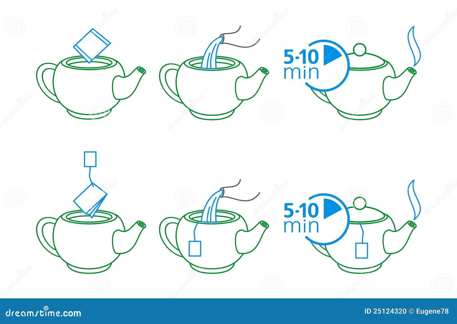
I feel this diagram above is to minimalistic and really only shows three stages if there was someone who did not have a clue to make a cup of tea I feel they would struggle with understanding this illustration.
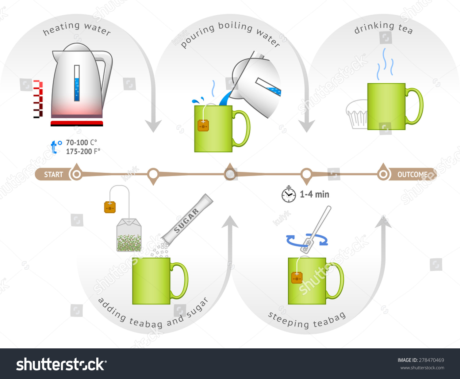
This one above is quite technical but I can understand it well and the process is easy to understand.

This one above only shows you what you need but not how you use them together to make a cup of tea.

I like the illustrations on this one as they are easy to understand with simple illustrations. There is little written text on there which shows the illustrations do the talking.
I have decided for this step-by-step illustration that I need 5 steps. They are:
I feel that these steps indicate clearly how to make a cup of tea. I am now going to sketch a few ideas and other ways I could show these steps, to create an understanding illustration with easy diagrams on how to make a cup of tea. In the exercise it mentions to use little or no words as possible and that the illustrations should demonstrate the process. I'm going to try as hard as I can to create an illustration with not many words but is also easy to understand.


As you can see above I have practiced in my sketchbook and come up with a few good ideas. The one I like the best where the steam coming from the finish cup of tea at the bottom and putting bubbles of step-by-step instructions along the steam. I am now going to try and sketch my idea and see how it comes across:


Here below are some or sketches that I have done in the last week as well as doing my degree:

I really like Disney so sometimes I have a spurt to drawing the characters. I drawed the Beast on an A3 piece of paper using a HB pencil. I got a great amount of feedback from it on Instagram and I really enjoyed using a pencil to sketch the tones on to the character

Here above is a collage I did in my sketchbook just to play around with some pieces that I had floating about to see what I could create. I ended up making a college that kind of had a message about getting married. I feel really pleased that I have created my first kind of college. I have done enjoyed making the college it is very experimental and very creative using your imagination. I like how I did the college and then use the pen to put the chain and ball on the bride's dress. The two hoops at the top indicate the marriage rings and obviously the white dove head, all are symbols of marriage.


Above is a sketch I tooked from a real life cheetah in a photo and then turned him into a cartoon personality character. I think he looks really cool and he looks as though he's thinking about food. I used a biro and pencil to create my sketch.

Above I sketched half woman half cat character.I was just playing around with a pencil doing different shapes and it ended up with this.

- Pour hot water into a cup
- Wait 3 mins to set the tea in the water
- Add milk and sugar
- Stir together
- Finished cup of tea
I feel that these steps indicate clearly how to make a cup of tea. I am now going to sketch a few ideas and other ways I could show these steps, to create an understanding illustration with easy diagrams on how to make a cup of tea. In the exercise it mentions to use little or no words as possible and that the illustrations should demonstrate the process. I'm going to try as hard as I can to create an illustration with not many words but is also easy to understand.


As you can see above I have practiced in my sketchbook and come up with a few good ideas. The one I like the best where the steam coming from the finish cup of tea at the bottom and putting bubbles of step-by-step instructions along the steam. I am now going to try and sketch my idea and see how it comes across:


As you can see from the drawings above these are my quick illustration of how it is going to look. This would be a good example for visual mockup.
I have decided I want to use calming colours because when I have a cup of tea it's a sign of relaxing. I think cream and a darkish green (natural colour as tea is a natural substance) background colours would work well and make the bubbles stand out with the steps in. I have been practicing a little in Photoshop recently and have decided to give this a go in Photoshop to see what I can come up with.

Here above is a cup I created on Photoshop to start my illustration.

Today I had a little issue where I created the above illustration on Photoshop and it was going really smoothly. I saved to file and came back on the computer a few hours later and the file was corrupt, so I lost my work. It is frustrating as I thought I was doing a good job of it. I have left it for a day for me to come back to it and begin it again now.
Looking at it I feel that the steam needs to be more cream and the background needs to be more green and it is lacking colour which will make it more attractive.
Looking at it I feel that the steam needs to be more cream and the background needs to be more green and it is lacking colour which will make it more attractive.
After attempting again on Photoshop here now is my illustration so far today:

As you can see I have started putting the steps into the bubbles in the steam. I feel that this is looking really well and it will be easy to understand when it's finished.
One of the issues I can see whilst doing this illustration is that steam rises upwards so I am questioning myself if the steps need to start from the bottom by the cup and work upwards as steam rises or do I start from the top of the steam and work downwards towards the cup which is the finished produce? I am going to continue with my illustration from working top to bottom and then I am going to go onto the OCA illustration Facebook page and ask other students what they think of my design to see if they point out this issue that I feel may be quite a big problem.

Above is my finished final piece. I think it looks great it may need to be some tweaking with the directions as spoken about previously. However I think I have got a good idea here with the steps being in this team of the cup of tea. I am now going to go on Facebook and ask for other students opinions.
Talking to other students ended up being a great idea as I got some great feedback and help me to see what direction I needed to go in to make my illustration better please see the comments I received below:


As you can read from above, I was correct about the steam with the steps going downwards as steam rises and also that I ended up adding another step into my illustration showing putting the tea bag into the cup, as people thought it didn't look clear enough. Below is my final illustration. Also the time on the timer was confusing, so I changed it to say 3mins instead of 180 seconds.
Here is the finished illustration below:
Here is the finished illustration below:

Overall I think it looks great, I think it's easy to understand. I have had to use a little wording so people can understand my illustration and made it more clearer. I'm not happy with the style of my start text but it helps people to see what direction they need to go in.
My illustration OCA student friends seem to think it looked fine and I am glad that they mention to add another step in. Now my illustration looks more clearly and in a better composition with that extra bubble.
I think overall my illustration gives out easy instructions that you can follow at home, to create a lovely cup of tea. I found that I am beginning to get to use to Photoshop a bit more as I'm experimenting along with it.
Further Sketching and experimenting
Here below are some or sketches that I have done in the last week as well as doing my degree:


Here above I found an animal magazine out and wanted to draw different animals eyes. I enjoy drawing them, It's the first thing I start doodling usually so I wanted to experiment with a few different tools and to create different skins and eyes I used coloured pencils, felt, paint and ink. I like the tiger's eye and the crocodile's I think I look very realistic.


I then decided to try out some watercolor pencils to see how I get along with them. They don't look very well here but I did have fun using them and will try them out again. I like how you can colour it in then add water and the colour just comes out at you. It is a great way to fill in areas to create a smoother effect.


