She gave me lots of great comments but I want to concentrate on the areas I need to improve on to push me forward.
Tutors Critique:
- When I use illustrator/photoshop my style goes, find a way to keep with my style perhaps look for a way of doing a paper style in digital.
- Keep practicing sketching/drawing skills are a must for any illustrator
- For my animals around the world book cover, she could see its great potential but pointed out I should have done some more prep work in thumbnails for it as I had no room for the text and also could have done something better with the composition. I have enjoyed creating the image so much but then the text is sort of an afterthought that I have applied. I need to do a little more design planning until I have exhausted my idea.
- I should really research text with illustration by now I should have got the basics of this.
- Doing children books in paper Judys comment 'One thing to bear in mind though, the technique you are using is developing really well but you have until now mainly tackled single characters with a minimal amount of background. If you are thinking of using the same technique for illustrating stories you are going to have to start thinking about how you will tackle whole scenes. Will you do them in cut paper or will you use a different technique for the backgrounds? If you are going to use paper I would think that you will need to create backgrounds separately. This could be an advantage as perhaps you could use the technique that animators use and create a large scene for the action to take place on so that you can add your characters after. It’s great to see how well your style is developing and how much you are enjoying your work!'
- I leave text elements to late in the design process and should think of these at an early stage as they affect my overall illustration I may be putting my hard work into my illustration but the weak and less experience of my type knowledge makes my work look lacking in the end result.
References she gave me to read:
Do some research into how to integrate text and illustration. The books below both have good advice on this:
Davies, Jo & Brazell, Derek (2014) Understanding Illustration, London: Bloomsbury Salisbury, Martin & Styles, Morag (2012) Children's Picturebooks: The Art of Visual Storytelling, London: Laurence King Publishing
My Main keys of improvement before my final assignment are:
Composition rule of thirds
lettering with illustration
sketching every day
I plan to learn, improve and do these main key areas I have to improve on :)
I am keen to get started but first, want to take on board my tutor's comments and do a bit of reflecting:
- Doing children books in paper Judys comment 'One thing to bear in mind though, the technique you are using is developing really well but you have until now mainly tackled single characters with a minimal amount of background. If you are thinking of using the same technique for illustrating stories you are going to have to start thinking about how you will tackle whole scenes. Will you do them in cut paper or will you use a different technique for the backgrounds? If you are going to use paper I would think that you will need to create backgrounds separately. This could be an advantage as perhaps you could use the technique that animators use and create a large scene for the action to take place on so that you can add your characters after. It’s great to see how well your style is developing and how much you are enjoying your work!'
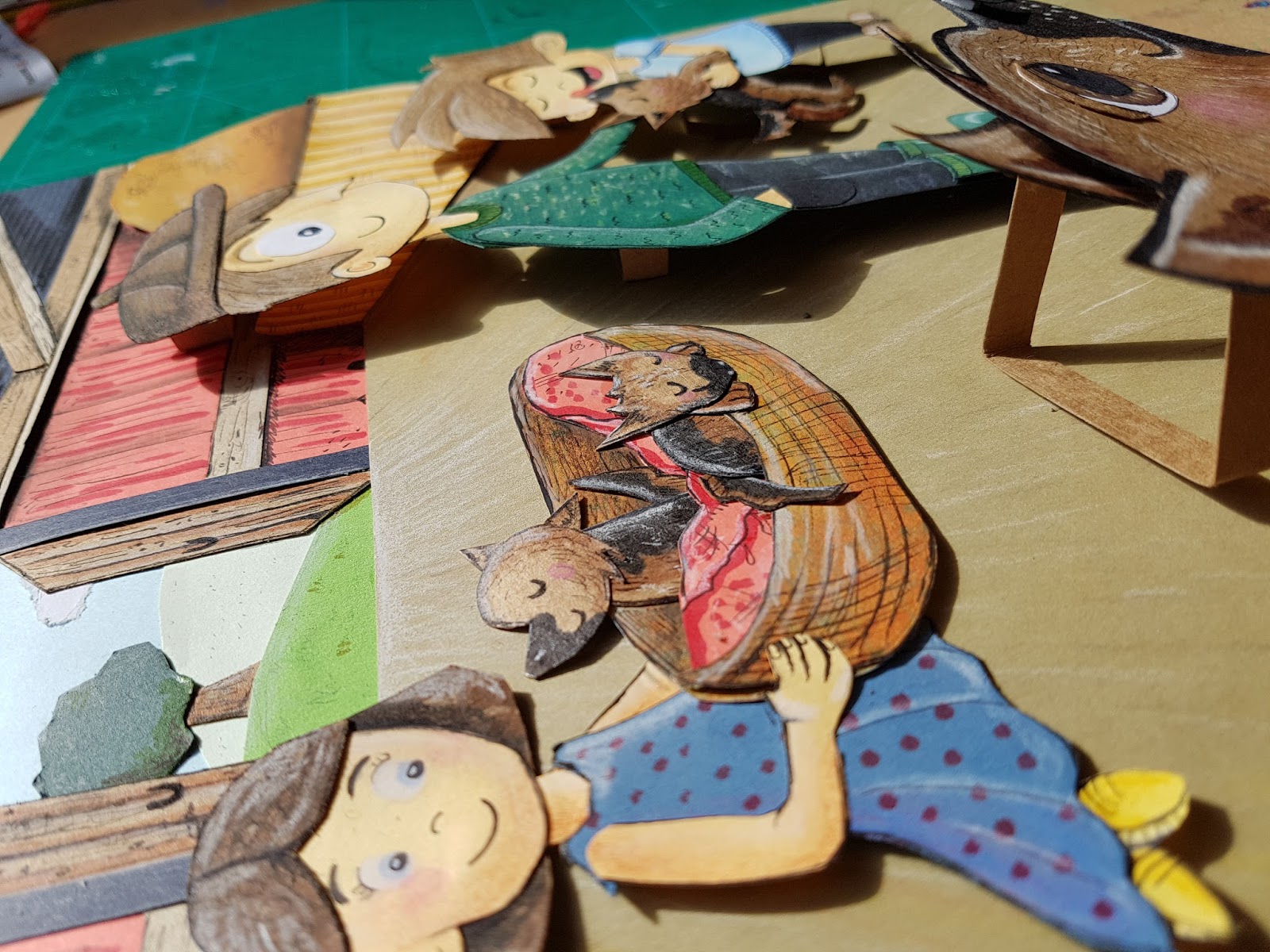
Whilst I was waiting for my feedback I actually did a scene for the children's book that I have been asked to do a few illustrations. Please see pictures below:


After looking at my idea above I felt it did take a while and you can't really see the depth in the background. You can see the depth with the characters on the background but the natural shadows by their feet make them look like they are floating over the floor. I had a look on the internet and I was lucky enough to come across this artist :


Her work is beautiful and the paper landscape idea makes it so magical and I think this is more what just meant to make it more animated. My attempt was not upright like these it was flat and I places my characters on top of it. Her compositions are beautiful and she has really thought about the colours and it makes the views want to step in. I like how she has put objects of the landscape also in the foreground.
This way produces 3d landscapes out of paper but in a more pop up style. I really think this is a wonderful way to make your story come to life and so I am going to re-attempt and try doing it more 3d like this style than how I attempted it(upright instead of looking down on the illustration). I'm actually excited to try this out/. I will write-up on here once I have had a go at it.
Last week I got in touch with a paper artist called Caroline Boyk. Lucky she responded and informed me of a class she has put online to help with paper cutting. He is the link below.
https://www.skillshare.com/classes/Paper-Cuts-Create-an-Original-Cut-Paper-Illustration/1580911171/classroom/discussions?via=logged-in-home-your-classes&enrolledRedirect=1
I had to join skill share but I got two months free so I managed to watch the whole course which was amazing! I learned a lot of ideas such as how to make them more faster by photocopying your work and putting that over the colour paper to cut out with my craft knife. Also glueing techniques and how to use the mount of a frame to your benefit to make your work look really professional in a frame. I emailed her about how much I enjoyed it and asked if she could look at my work and to give me some feedback. This is what she said below:
----------------------------------------------------------------------------
Hey Gemma, thanks so much for reaching out! Sorry for the delay in response, it's been a crazy week. I'm glad my Skillshare videos helped you out (if you don't mind sharing a positive review for the class, it'd be a huge help and much appreciated). I'd be happy to answer questions for you!
Your stuff is great, I love your techniques and how you're mixing flat painting and the 3D paper effect together.
My biggest critique is to really work and push your compositions more. A lot of these pieces are very similar with all of the main action in the center. Challenge yourself and tell a story within an illustration and work to lead the viewer's eye through the illustration. Here's a great resource on a composition exercises http://www.learning-to-see.co.uk/dow-three-c
Never take your first sketch to final. Do a minimum of 10 sketches for each piece you plan to do, all with different compositions. Almost guaranteed your later ideas will be better than your first!
Here's a great explanation of other compositions (I am a huge fan of the rule of thirds): http://www.creativebloq.com/digital-art/tips-composition-31514496
Try applying those to your sketches and artwork. Something like the animals in the world illustration could go from good to phenomenal with special attention to the background, implied visual lines and more composition work. You could have taken vines and made them circle the world instead of coming from the corners to keep your eye circling the piece.
Also, keep in mind values, some of your values get lost and you miss you on some of the great shapes you have. White backgrounds take away from the mood of the piece and almost feel unfinished. For example the owl would benefit so much from a dark green or deep blue background to really help create the mood of him sitting in a tree at night. Some of his feathers would benefit from a LITTLE lighter value because he gets lost in the hole he's sitting in. If the white background was a deep dark color, your eye would instantly go to his face (the lightest value) instead of competing with the background. As an exercise, try a version of that illustration at night where the tree isn't brown, but another color. Challenge yourself to still make it seem like a tree without being forced to make it brown. Or even try a few sketches at different times of day, and how the colors would change across the owl, tree, background, and leaves.

As an illustrator, you should be keeping a sketchbook with you always and be constantly sketching from life. If you go to a coffee house sit there for 15 minutes sketching the people there. If you're at the beach, do the same. Just constantly be drawing the people and animals around you. The better you are at life drawing, the better you can exaggerate and stylize your illustrations. It only stands to make you a stronger artist!
I hope this helps a little. Feel free to reach out with any additional questions!
-------------------------------------------------------------------------------------------------
Her critique was an eye opener and I didn't realize that all my illustrations looked the same with things in the middle of the page and they are! I did read the rule of thirds 2 years ago but I have forgotten to implement this in my work and Judy is also right too that I am too into my paper cutting that I am not thinking about the other things, Composition, Colour, and Text. I feel a bit down about that I have not remembered things that are crucial to my work but I am going to pick my self up and learn from it on this last assignment. I really now need to push my self to a level I didn't know I could achieve and really get myself disciplined to remember steps. I need to do be stricked with my self and stick to these rules:
Also if it is a commission and it needs a frame I need to think of the frame also size etc
I think my keeping to these rules to each artwork I do, I will get a better result I just think I've been into creating things out of paper that I have lost the basics that you need to form a good illustration. I am definitely going to keep to this in this ass 5 and get into the habbit.
I am going to sketch everyday instead of every few days to improve starting today:


After looking at my idea above I felt it did take a while and you can't really see the depth in the background. You can see the depth with the characters on the background but the natural shadows by their feet make them look like they are floating over the floor. I had a look on the internet and I was lucky enough to come across this artist :
Kelly Pousette
https://www.instagram.com/kpousetteillustration/?hl=en
Her work is beautiful and the paper landscape idea makes it so magical and I think this is more what just meant to make it more animated. My attempt was not upright like these it was flat and I places my characters on top of it. Her compositions are beautiful and she has really thought about the colours and it makes the views want to step in. I like how she has put objects of the landscape also in the foreground.
This way produces 3d landscapes out of paper but in a more pop up style. I really think this is a wonderful way to make your story come to life and so I am going to re-attempt and try doing it more 3d like this style than how I attempted it(upright instead of looking down on the illustration). I'm actually excited to try this out/. I will write-up on here once I have had a go at it.
Contacting other paper artists helps
https://www.skillshare.com/classes/Paper-Cuts-Create-an-Original-Cut-Paper-Illustration/1580911171/classroom/discussions?via=logged-in-home-your-classes&enrolledRedirect=1
I had to join skill share but I got two months free so I managed to watch the whole course which was amazing! I learned a lot of ideas such as how to make them more faster by photocopying your work and putting that over the colour paper to cut out with my craft knife. Also glueing techniques and how to use the mount of a frame to your benefit to make your work look really professional in a frame. I emailed her about how much I enjoyed it and asked if she could look at my work and to give me some feedback. This is what she said below:
----------------------------------------------------------------------------
Hey Gemma, thanks so much for reaching out! Sorry for the delay in response, it's been a crazy week. I'm glad my Skillshare videos helped you out (if you don't mind sharing a positive review for the class, it'd be a huge help and much appreciated). I'd be happy to answer questions for you!
Your stuff is great, I love your techniques and how you're mixing flat painting and the 3D paper effect together.
My biggest critique is to really work and push your compositions more. A lot of these pieces are very similar with all of the main action in the center. Challenge yourself and tell a story within an illustration and work to lead the viewer's eye through the illustration. Here's a great resource on a composition exercises http://www.learning-to-see.co.uk/dow-three-c
Never take your first sketch to final. Do a minimum of 10 sketches for each piece you plan to do, all with different compositions. Almost guaranteed your later ideas will be better than your first!
Here's a great explanation of other compositions (I am a huge fan of the rule of thirds): http://www.creativebloq.com/digital-art/tips-composition-31514496
Try applying those to your sketches and artwork. Something like the animals in the world illustration could go from good to phenomenal with special attention to the background, implied visual lines and more composition work. You could have taken vines and made them circle the world instead of coming from the corners to keep your eye circling the piece.
Also, keep in mind values, some of your values get lost and you miss you on some of the great shapes you have. White backgrounds take away from the mood of the piece and almost feel unfinished. For example the owl would benefit so much from a dark green or deep blue background to really help create the mood of him sitting in a tree at night. Some of his feathers would benefit from a LITTLE lighter value because he gets lost in the hole he's sitting in. If the white background was a deep dark color, your eye would instantly go to his face (the lightest value) instead of competing with the background. As an exercise, try a version of that illustration at night where the tree isn't brown, but another color. Challenge yourself to still make it seem like a tree without being forced to make it brown. Or even try a few sketches at different times of day, and how the colors would change across the owl, tree, background, and leaves.

As an illustrator, you should be keeping a sketchbook with you always and be constantly sketching from life. If you go to a coffee house sit there for 15 minutes sketching the people there. If you're at the beach, do the same. Just constantly be drawing the people and animals around you. The better you are at life drawing, the better you can exaggerate and stylize your illustrations. It only stands to make you a stronger artist!
I hope this helps a little. Feel free to reach out with any additional questions!
-------------------------------------------------------------------------------------------------
Her critique was an eye opener and I didn't realize that all my illustrations looked the same with things in the middle of the page and they are! I did read the rule of thirds 2 years ago but I have forgotten to implement this in my work and Judy is also right too that I am too into my paper cutting that I am not thinking about the other things, Composition, Colour, and Text. I feel a bit down about that I have not remembered things that are crucial to my work but I am going to pick my self up and learn from it on this last assignment. I really now need to push my self to a level I didn't know I could achieve and really get myself disciplined to remember steps. I need to do be stricked with my self and stick to these rules:
- 1 sketch ideas 10 thumbnails - Think about composition - Think about text if there is any
- 2 Choose Idea and then do some more sketches to amend idea further
- 3 Do final sketch
- 4 Think of Colours
- 5 Look at it once more and if happy start paper illustration final.
Also if it is a commission and it needs a frame I need to think of the frame also size etc
I think my keeping to these rules to each artwork I do, I will get a better result I just think I've been into creating things out of paper that I have lost the basics that you need to form a good illustration. I am definitely going to keep to this in this ass 5 and get into the habbit.
I am going to sketch everyday instead of every few days to improve starting today:

Heres my sketch of my new cactus cute! I'm going to keep doing this more to build up my life drawings of different things and I may venture out to a cafe soon too.
Some useful links to help motivate me on sketching:
https://cgcookie.com/articles/5-tips-to-help-you-draw-more
https://creativemarket.com/blog/how-to-do-a-sketch-365-or-sketch-a-day-challenge
http://conceptartempire.com/build-a-sketching-habit/
Lets get started!
No comments:
Post a Comment