Assignment 4 Final - Magazine Illustration
So now I have finished all the exercises in assignment 4 and I am now ready to use what I've learnt to start my final assignment.
The brief is that it is for a magazine company and they want an illustration to put in their magazine. They gave you four words to choose from which were Lost, Discovery, Disaster and Guilty secret. I have wondered about this assignment for some time and if I am honest I am still struggling on what I would like to do, so I think for some help I am going to do a spider diagram on each word and try and explore each area and see what ideas I can come up with.
I have now done my Spider diagrams and here they are below:


I did decide after doing these spider diagrams, that I wanted to do lost property, however last night when I was setting up a still life for it, it just didn't feel right and the placement where I was putting the property just did not feel right. My idea was that I was going to do lost property and have some nymph fairy-like creatures digging in there, finding stuff, but really thinking about it perhaps it should have been in the garden and an old shoe was lost and they were trying to use it for something to live in.
As I was still struggling to think of an idea and I was not entirely happy, I decided that as I was going away for a long weekend break anyway and it would give me time to think about for a while and come back with a fresh head.
One of the days I was hiring a bike and was going on a trail, one of the guys who I brought the bike from gave me a map and told me different trails in the park would lead me to various geological sites where fossils had been discovered. While I was doing this bicycle day. I discovered that I was actually using one of the words from this assignment which is discovery. I then decided that I could perhaps use an area or a place as an illustration and do it as a map with aspects of key points in that area. Maybe this illustration would be good for a travel topic. So now I've got home and I still feel actually more confident and happy in this idea, then that idea previously, so what I'm going to do now is do a spider diagram for the word Discovery and see what ideas I can come up with:

As you can see above is my spider diagram of my ideas about Discovery I had a real good think about places I had been and to give people a tour in my illustration. I am a big Disney fan and I have been lucky enough to go to Disney World Florida a few times I thought of creating a map of Florida and putting key locations around the map I think that I would fully enjoy doing this and especially because it will be a challenge for me as I want to make it as a 3D illustration out of paper. The next step for me is to have a look around my home for a still life. I have a few maps of Florida in my travel box and I am now going to look around to find what things I can find for my still life to represent travelling and discovering Florida.
I have come across and collected a few things I think will appeal for a travel illustration. So now I am going to take a few photos of my selected items to create a Still Life sculpture that I can study and draw.


Here above are some photos that I took of my selected items, however, when looking back at these photos and the still life that I want, I felt it was too complicated and I wanted it somehow to show the frame of the country of the land and have it a bit more fun to look at. What I have decided now is to have a look on Pinterest for some ideas to try and get my ideas across that I have in my mind please find below the link to my Pinterest board for the map of Florida:
https://www.pinterest.co.uk/GemmaMlees/discovery-ass-4
As you can see here there are some particular images that I am interested in especially the ones with the shape of the land and they have selected iconic points in Florida that tourists would want to see. They have also made their maps quite fun to look at adding characters and creatures that you would find in Florida.
I am now going to attempt my still life again, but this time I have decided that to get the land shape of Florida. I am going to draw out the shape and cut it out of paper to have that as the basic layout and then using my items I have selected. I will put them around the land of Florida. Please see my photos below:


As you can hopefully see clearer above from the photos of what I meant by creating a Florida land out of paper to get the overall shape I am happy with my layout and I think fewer items is better as it is clearer and I can add multiple narratives to this later on with characters perhaps and animals that live in Florida such as alligators. My next step now is to draw this out as a line drawing to grasp the outlines and the structures of each individual object:


Ok, I feel it's looking good now, so the next part I need to do is the land. I looked in my art room and found some green material to work with. It's a bit like paper but also a bit like a cotton texture to it. I have now got it and drawn out my shape of Florida and pasted it onto the sea as below:

I think the two textures work well together and it makes the land stand out from the board. Next, I am going to cut out some templates to put my Still Life on to the board to test it and also add in some other objects, where I can fit them:


As I am very satisfied with my still life items, I am going to start making those first out of paper.
I am now going to start making the pair of binoculars taking photos step-by-step of how I have created them:
First of all I look at my drawing and cut out the certain shapes that I need to form a 3D pair of binoculars.


Now the one side and the middle part is now done, I can now put on the other lens to finish off the binoculars. I have used double sided sticky tabs to stick them together to make certain layers higher than the others.


Above - camera added please note the rectangles pieces of paper with the names on are just so I know the main areas of the map which I want to pinpoint out.


Above in the photos is another example of how I have looked at an object and break it down to create layers to form a 3D effect in my illustration of the objects. Once finished and put on the details I then stick them together in a particular order to what you see furthest away to the closest point of the object to me.

The above is now my Still Life objects completed and onto my board so far looking great the only issue I have is the passport. I just don't think it comes out right. I think it is due to having to do writing on there which does not go with the other items and the style. I might think about this item as I go on and what to do with it.


As you can hopefully see clearer above from the photos of what I meant by creating a Florida land out of paper to get the overall shape I am happy with my layout and I think fewer items is better as it is clearer and I can add multiple narratives to this later on with characters perhaps and animals that live in Florida such as alligators. My next step now is to draw this out as a line drawing to grasp the outlines and the structures of each individual object:


Here above is my sketch my Florida map and my objects around the land. I have looked at them carefully studying the lines, textures and feel that these are correct to the objects I was looking at. Now the next thing I have to do is add tone to show where the light hits these objects to grasp their volume on to the page.

The above is my illustration of the items now having the tone in place. I used ink to add the tone effect on to the objects. I think I have done really well here grasping where the light is coming from and the detail of the objects accurately. The next step for me is to decide where to start on my 3D illustration. I've decided that I am going to use a board to work on.
The first basic layer of my illustration is going to be the sea. I have managed to get hold of the large blue paper and in the past in previous exercises, I have found that by scrunching up the paper it creates a good texture for certain things such as water stone depending on the colour also. For the sea, I am going to use blue paper but scrunch it up as much as I can and then lay it flat and glue it on to my board:

I love this texture from scrunched up paper makes it's so dimensional and unique! and all the different shadows appeal to me.
Above - My sea on the board glued down.


As you can see I have made a few template such as the binoculars the camera, passport and I've also added in some oranges and a little shape which is supposed to be an alligator. I have just done some basic shapes so I know what space I have got on my map to fit certain things in.

I am now going to start making the pair of binoculars taking photos step-by-step of how I have created them:
First of all I look at my drawing and cut out the certain shapes that I need to form a 3D pair of binoculars.
So I have the shapes that I need.I now need to start as above putting them together and I am adding details using a black Sharpie and a white pastel, which I can smudge to create tone. It will help give a good smooth texture effect to my binoculars.


The above are my final designs of my binoculars, I think I've done a good job here I have also used some black paper and carefully cut it out to create the cord chain that goes on to the binoculars which you would put around your neck.
The next step is to create the other object such as the camera and the shells.


The next step is to have a look at my idea and see if there is anything I need to move around and obviously start thinking of things that I want to add to it.


Here below is my illustration of the key points that I want to put on my map and a few different layout ideas:


As you can see I have got quite a few main points: Orlando with the Disney theme parks, Daytona Beach where they do the drag racing, Miami the city of Florida, Clearwater Bay
I have had a look at the layout and have decided to take the passport away from the illustration. I feel that it will look better without it and there will be enough room for the main points that I want to show in my illustration of florida.

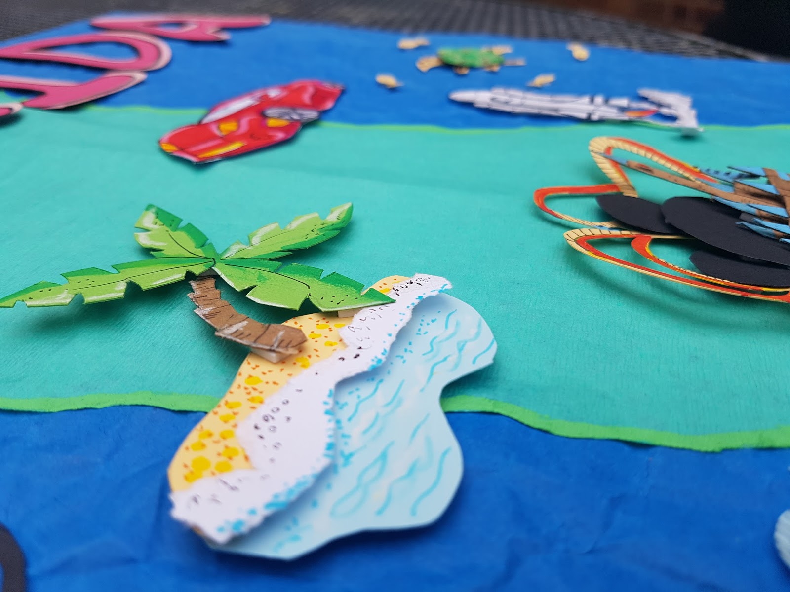
In this photo, I have cut out all the basic shapes of the icons and used white paper just to temporarily put in the dotted lines on the map just so I can get a sense of what it's going to look like. I really like the title Florida in the pink. I think this sets it off really well and brightens up the illustration in contrast to the green and the blue. I've even attempted to bring back the passport and put it in that area where I am thinking to put the scuba diver, but I am still convinced the scuba diver is going to look better and will fit in a lot more than the passport on the map.
Now that I have got my idea I'm ready to continue with my actual map and to add the details to the items. I am now going to create them in my 3D paper technique:


Bugsy helping me out :)


As you can see above, I have added quite a lot of the items now. I made the spaceship, racing car, flamingo, oranges, alligator, Dali Museum and Clearwater Bay. They are all made out of paper and then stuck on to my overall illustration. I am now going to continue adding other items and deciding as I go to make sure I have got the best composition possible. For the detail I am using various mediums such as pencils pastels, felts and paints. This is so I can capture all the textures and colours I want to use.
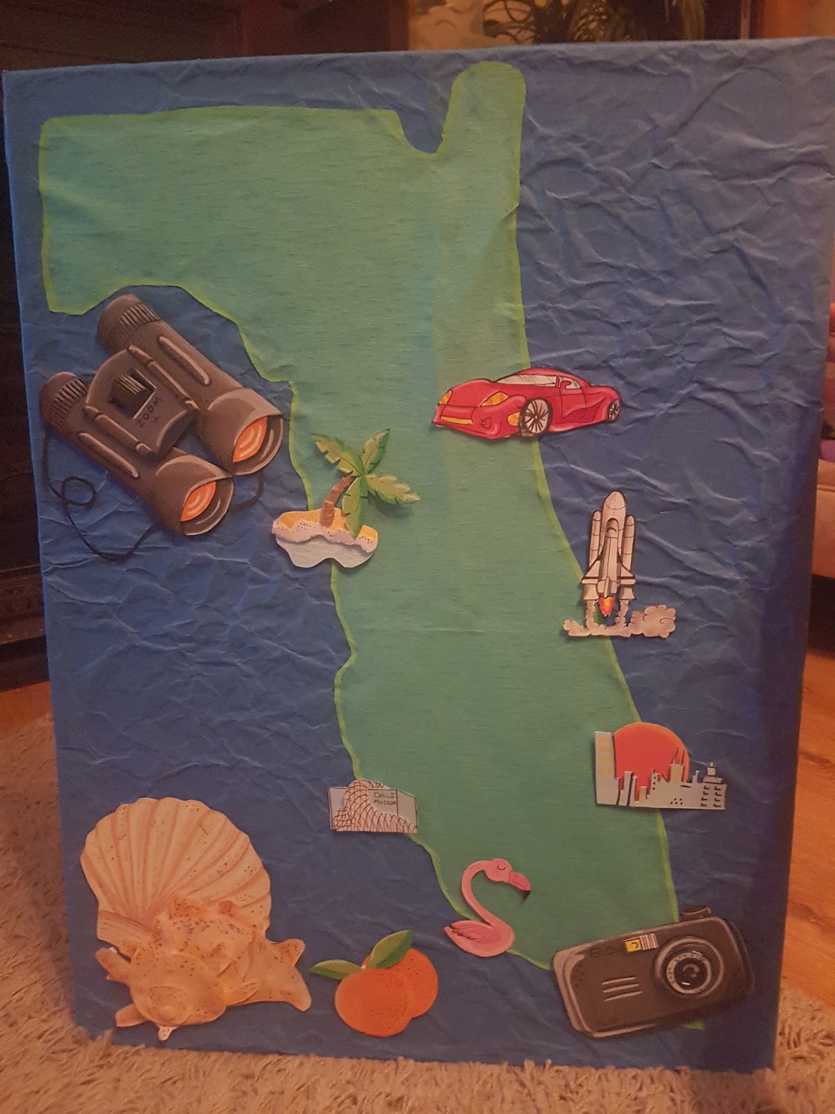
Finished paper illustration
Here below is my finished illustration that I have done with paper:


The above is a screenshot of what I have done so far in Photoshop. I think that the trail I have done in white needs to be thicker, but I am also going to redo it in green instead. I have put the writing next to some of the icons, but feel it is quite flat. I am going to try and perhaps put them on rectangles like a border to them and add Shadows to bring depth to the front description.
Here is my finished illustration:

I have messed about in Photoshop and I can now say after a few hours of tweaking, I have finished my final for assignment four.
I am really happy with my illustration I changed the white trail to the darker green and it looks a lot better, easier to see and I have also used oval rectangles with the font on to make the icon areas stand out more with their descriptions clearer. I think my illustration suits a magazine very well in regards to discovering a place. It is very bright and it tells you what it's about by just looking at it. It was a great experience to do this illustration. I did it on larger than A3 size but then reduce the size in Photoshop to A3 for the magazine company. I know I struggled at the start of this assignment with what I wanted to do. I did pick the word lost and was going to do an illustration of lost property, but it just did not feel right.
I am so happy I went away and had time to think about what I wanted to do. Discovering a land and showing people my favourite parts, when I travelled there is really good fun to make and I shall be keeping this for myself once the course is over. I think my 3D illustration is definitely my style and I do want to improve further.
This assignment four has helped me develop a lot more and research into my paper crafting skills. I never thought I would get into paper crafting or perhaps I didn't even know what it was a few years ago and I am actually really enjoying the experience and excited to see what I can come up with and where it is going to take me in the future.


I took it outside to take good photos of it and they have come out really well. You can see the depths into my work and the quality and creativity that I have produced along the way. I think my map is very bright, very attractive to the eye and it is a great illustration that will keep you entertained for a few minutes. I think viewers, whilst looking through the magazine, will take the time to look at all the key areas on the map and the characters. I am really happy with the scuba diver choice over the passport. I feel it sets off the illustration well and it is a part of the holiday experience in Florida.
The next process I want to do is now with one of my best photos put it into Photoshop and edit it on there. I want to put in the dotted lines of the trail on the land and also put in the names of the key areas. I would like to also see if I can add more depth to my Shadows and just mess about with the tones till I'm happy with it

Here is my finished illustration:

I am really happy with my illustration I changed the white trail to the darker green and it looks a lot better, easier to see and I have also used oval rectangles with the font on to make the icon areas stand out more with their descriptions clearer. I think my illustration suits a magazine very well in regards to discovering a place. It is very bright and it tells you what it's about by just looking at it. It was a great experience to do this illustration. I did it on larger than A3 size but then reduce the size in Photoshop to A3 for the magazine company. I know I struggled at the start of this assignment with what I wanted to do. I did pick the word lost and was going to do an illustration of lost property, but it just did not feel right.
I am so happy I went away and had time to think about what I wanted to do. Discovering a land and showing people my favourite parts, when I travelled there is really good fun to make and I shall be keeping this for myself once the course is over. I think my 3D illustration is definitely my style and I do want to improve further.
This assignment four has helped me develop a lot more and research into my paper crafting skills. I never thought I would get into paper crafting or perhaps I didn't even know what it was a few years ago and I am actually really enjoying the experience and excited to see what I can come up with and where it is going to take me in the future.