History of Illustration
Out of the 6 illustrators in the exercise to look at, I have decided to investigate E H Shepard's work.
E H Shepard

E H Shepard is well know for creating the illustrations for Winnie The Pooh and Wind In The Willows. I have had a look on the internet and I can see that he also did more then that:
He first started off as a painter in 1907 and did illustrations for journals and periodicals. In 1921 he worked at Punch, a magazine and became the top cartoonist in 1945. In the Punch magazine Shepard created political cartoons which were full of literary allusions - with visual references to Sir John Tenniel's illustrations for Alice's Adventures in Wonderland and for novels by Charles Dickens. His love of animals led him to include them as part of his composition wherever possible in his cartoons.

Problems of etiquette for animals
http://www.chrisbeetles.com/gallery/animals/problems-etiquette-animals.html

County songs XXV Cumberland
http://www.chrisbeetles.com/gallery/topography/britain/county-songs-xxv-cumberland.html

During the first world war Shepard served in France, Belgium and Italy. He got awarded the bravery award and by the end of the war he reached rank of major. Through out the war he continued to draw and illustrate, mainly of life on the front line. From the 1930s and through to the gruelling wartime years of the 1940s, Shepard's humour remained gentle and uplifting.

A watercolour showing the view from Shepard's dugout at the Somme, 1916
http://www.telegraph.co.uk/news/newstopics/howaboutthat/11966866/First-World-War-sketches-by-Winnie-the-Pooh-illustrator-discovered-in-trunk.html

A watercolour of a French biplane that officially had a 'bad landing' but had in fact been shot down by friendly fire. The Somme, 1916
http://www.telegraph.co.uk/news/newstopics/howaboutthat/11966866/First-World-War-sketches-by-Winnie-the-Pooh-illustrator-discovered-in-trunk.html

Self portrait sketched at some point during Shepard's time on the frontline but signed and dated February 5, 1974
http://www.telegraph.co.uk/news/newstopics/howaboutthat/11966866/First-World-War-sketches-by-Winnie-the-Pooh-illustrator-discovered-in-trunk.html

In the trenches: This sketch shows a more senior officer taking recruits through a training exercise
http://www.dailymail.co.uk/news/article-3296906/Poignant-sketches-Winnie-Pooh-illustrator-E-H-Shepard-World-War-trenches-discovered-trunk-not-opened-100-years.html
 Sense of humour: This cartoon of German soldiers jokingly suggest they are using fatter comrades as trampolines to cross Belgian trenches. Even in the darkness of war, some of his efforts have a humorous bent
http://www.dailymail.co.uk/news/article-3296906/Poignant-sketches-Winnie-Pooh-illustrator-E-H-Shepard-World-War-trenches-discovered-trunk-not-opened-100-years
When author AA Milne asked EV Lucas, another member of the Punch table, whom he would recommend to illustrate some children's verse, Lucas named Shepard. But Milne was reluctant to use Shepard, believing he did not have the style he wanted.However, when Milne was finally persuaded to use Shepard in 1924 to illustrate his poems, When We Were Very Young, he was delighted with the result.
Reaching for honey
http://www.chrisbeetles.com/gallery/literary/childrens-literature/reaching-honey.html

'Nearly eleven o'clock' said Pooh happily
http://www.chrisbeetles.com/gallery/literary/childrens-literature/nearly-eleven-oclock-said-pooh-happily.html
 http://www.dailymail.co.uk/news/article-3296906/Poignant-sketches-Winnie-Pooh-illustrator-E-H-Shepard-World-War-trenches-discovered-trunk-not-opened-100-years.html
So when it came to illustrating Winnie the Pooh, Milne insisted that Shepard got the job. Though Milne was always pleased with Shepard's work, the two men were never close. In terms of his inspiration, Shepard's beautiful line drawings of Pooh were not taken from Christopher Robin's bear, but by Growler, the much-loved bear belonging to the artist's son, Graham. his son Graham, serving in the Royal Navy, lost his life when his ship was sunk in the Atlantic.
Kenneth Grahame published The Wind in the Willows in 1908, it was not until 1931 that his publisher, Methuen, suggested commissioning E.H. Shepard to illustrate the book. Grahame had never been satisfied with previous attempts to capture the spirit of the animals and their world, but he had appreciated Shepard’s drawings for his books The Golden Age and Dream Days, and Shepard came further recommended by A. A. Milne,
The Shepard illustrations became an immediate classic – Kenneth Grahame’s response on being shown the drawings was, “I’m glad you’ve made them real.” The Wind in the Willows with the iconic Shepard illustrations has been in print and a staple of nurseries, schoolrooms, children’s bedrooms – and adult bookshelves – ever since.

http://www.eh-shepard.com/drawings-illustrations/

http://bibliodyssey.blogspot.co.uk/2009/07/wind-in-willows.html

http://bibliodyssey.blogspot.co.uk/2009/07/wind-in-willows.html
 http://bibliodyssey.blogspot.co.uk/2009/07/wind-in-willows.html
Today's Illustrator
Ronald Kurniawan graduated with honours from Art Center College of Design in California. Inspired by ideograms, syllables, letter forms, beasts and heroic landscapes, Ronald Kurniawan enjoys creating a visual language where the wilderness and civilisation could merge happily together. With the belief that the sublime and nuclear age could coexist, Ronald Kurniawan paints romantic environments and breaks the quiet scene with beasts and creatures.
His style is abstract . His choice of medium is painting, pencil and digital concept art. In his work his favourite subjects are humour, Action, Adventure, Animals, Celebrities, Character Development, Children's Books, and more. He has work for big companies such as Warner Bros, Disney, and Dream works,
All images below are from: http://www.ronkurniawan.com/


As you can see in the four images above, he has sketched his own illustrations out, scanned them into his computer and used a computer program such as Photoshop or InDesign to fill in and add colour and texture to the illustration. He uses tools in Photoshop such as a paint brush texture and pencil texture to fill in, which creates a natural effect. Ron make his characters popout from the page with colours that are really bright. His illustrations are fun to look at the sense of harmony . They give you a positive feeling when looking his illustrations. He has used his imagination a lot which I like and the outcome are great illustrations.

I really like this one it is colourful and he has created some interesting animals

Above is one of his illustrations that he did for PlayStation. I can relate to this as I do play on my PlayStation. It is bright full of imagination. I like the part where on top of the main creatures head he has turned it into water and there are two people in a canoe boat fighting the Rapids. I also like the turtle top right that is floating through the sky.

He has produced a lot for advertisements.This one is of a Coca Cola bottle with his imaginative creatures surrounding it, to make it stand out and make the bottle centre of attention. His typography also is worth a mention as he creates some great fonts that stand out and works well within his illustrations.
As you can see in the four images above, he has sketched his own illustrations out, scanned them into his computer and used a computer program such as Photoshop or InDesign to fill in and add colour and texture to the illustration. He uses tools in Photoshop such as a paint brush texture and pencil texture to fill in, which creates a natural effect. Ron make his characters popout from the page with colours that are really bright. His illustrations are fun to look at the sense of harmony . They give you a positive feeling when looking his illustrations. He has used his imagination a lot which I like and the outcome are great illustrations.
I really like this one it is colourful and he has created some interesting animals
Above is one of his illustrations that he did for PlayStation. I can relate to this as I do play on my PlayStation. It is bright full of imagination. I like the part where on top of the main creatures head he has turned it into water and there are two people in a canoe boat fighting the Rapids. I also like the turtle top right that is floating through the sky.
He has produced a lot for advertisements.This one is of a Coca Cola bottle with his imaginative creatures surrounding it, to make it stand out and make the bottle centre of attention. His typography also is worth a mention as he creates some great fonts that stand out and works well within his illustrations.

Illustration - How it has evolved over the past 50 years.
By looking at these two illustrators, I can see that they have there own Ideas. The main difference is how vast illustrations have changes within 50 years. I can Compare this to painting which has took 300 years plus more to evolve.
Technology is a big game changer. Now people can fill in illustrations with colour and texture like never before, they can added photo images and mix them in with illustrations. Using technology also help to create bright colours that help illustration stand out.
The next thing is the ideas. There is more imagination used now then before this due to people not being afraid to use there own ideas and expressing themselves.
Comparing Rons illustrations to Shepard now makes Shepard's seem old fashioned. This is because of the style and technique used. Technology has brought illustrating more forward. There are also new mediums to use in hand illustration. Also Shepard's sketches are wonderful but there scratchy and not rendered finely like Rons illustrations again this is due to technology. Shepard's work is also mainly just black and white, which we see less of today, this does influence it looking old fashioned. Shepard used pencil watercolours and inks/pen. Ron uses pencils and software for his illustrations.
Rons work attracted me because of the great bright and fun visuals he uses. He has done a lot of work for big names. His illustrations are clean cut and fun to look at. There is a lot going on in them, which makes you what to understand his work.
On this website below people were asking about Ron's technique. I guess they were quite surprised to find Ron actually commented to state what he uses:
http://linesandcolors.com/2008/11/20/ronald-kurniawan/
Ronald KurniawanFriday, December 5, 2008 at 10:22 am:
I traditionally paint my letterforms walking through the landscapes, but most of my illustrations are just done through photoshop. I will block in flat colors or gradations for the large shapes then start doing some detail work on the focal point. Sometimes I would scan in textures to overlay the whole image. Preferably painting the piece with acrylic is the way to go, but the deadlines wouldn’t allow me to do so, especially commercials.
I thought this was great to get his own answer to how he does his work.
I am now going to attempt each artists style and to see what I can come up with:
Shepard's Style
For the type of Shepherds illustration I'm going to attempt to do a few animals and just create a simple story in an illustration.
I have now drawed a few simple illustrations and I decided just to randomly pick some animals. I decided on a raccoon and a cow. I decided I wanted to make the raccoon a robber and obviously the cow as you can see my illustrations is a posh cow. I have roughly sketch out my idea.

My idea is the raccoon Robber running and stealing the cows handbag and necklace. I have found a quite humorous way and decided to put the cow in a coat made of cow skin. The Robber who is the raccoon does not need a mask as a raccoon already looks like he has one on naturally. Also he has black paws which looks like he has black gloves on. Now I've done a few sketches I want to do my proper illustration:

I have now finished my final illustration. As you can see it is quite like Shepherds work, with just the black and white sketch. I feel like the outcome was ok. I feel like I messed up the cows hair a little but managed to work on it and it doesn't look so bad now. I suppose this is another issue where nowadays, you can put your image into the computer and if there is any errors you can easily rub them out. I also think that even though this is an old fashioned way to do cartoons, I still enjoy doing it and is a base technique for today's illustrations.
Now I am going to have a go at Rons technique I have decided to use an item to advertise. I looked around the house and I decided on a bottle of fairy washing up liquid.
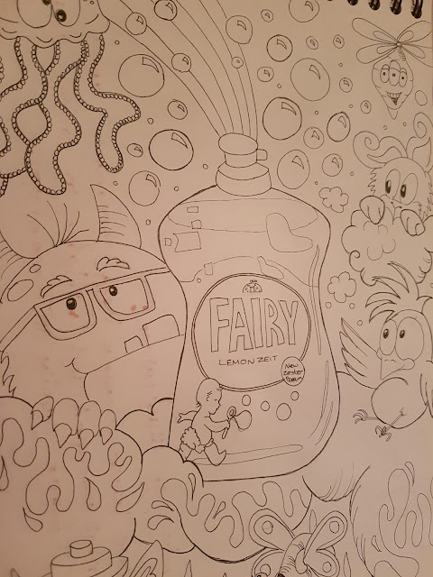
Then I quickly sketched it out and sketched some creatures out of my head around in the bottle making the Fairy liquid bottle the centre of attention.
I copied my illustration on my printed and this time just attempted to show shading in the image.

I have left my illustration black and white and I am now going to put it into the computer and just add some colour maybe a few techniques just to show how today's illustration works.

As you can see I have now finished the illustration and look how bright it has become using the colours on Photoshop and illustration. I was able to use a gradient technique in the pink background. I also think my Creatures standout and really advertise the bottle of fairy washing up liquid, which is bright yellow in the centre of the illustration. I could have added more detail but at this point I just wanted to show the clear difference from today's illustrations and the past
I have decided from looking at these two illustrators that illustration has evolved immensely over the years. I do think Shepherds way is today's basic starting point in creating an illustration. When we have that base we can edit it, work on it if need to add textures and tones. You can create a bright striking illustration with computers and other technology.
I have always enjoyed drawing and illustrating and I do want to become a children's illustrator for me to do this, I need to really understand Photoshop, illustrator and InDesign to improve my work if that is where I want to be.

I have now finished my final illustration. As you can see it is quite like Shepherds work, with just the black and white sketch. I feel like the outcome was ok. I feel like I messed up the cows hair a little but managed to work on it and it doesn't look so bad now. I suppose this is another issue where nowadays, you can put your image into the computer and if there is any errors you can easily rub them out. I also think that even though this is an old fashioned way to do cartoons, I still enjoy doing it and is a base technique for today's illustrations.
Ron's Style
Now I am going to have a go at Rons technique I have decided to use an item to advertise. I looked around the house and I decided on a bottle of fairy washing up liquid.

Then I quickly sketched it out and sketched some creatures out of my head around in the bottle making the Fairy liquid bottle the centre of attention.
I copied my illustration on my printed and this time just attempted to show shading in the image.

I have left my illustration black and white and I am now going to put it into the computer and just add some colour maybe a few techniques just to show how today's illustration works.

As you can see I have now finished the illustration and look how bright it has become using the colours on Photoshop and illustration. I was able to use a gradient technique in the pink background. I also think my Creatures standout and really advertise the bottle of fairy washing up liquid, which is bright yellow in the centre of the illustration. I could have added more detail but at this point I just wanted to show the clear difference from today's illustrations and the past
I have decided from looking at these two illustrators that illustration has evolved immensely over the years. I do think Shepherds way is today's basic starting point in creating an illustration. When we have that base we can edit it, work on it if need to add textures and tones. You can create a bright striking illustration with computers and other technology.
I have always enjoyed drawing and illustrating and I do want to become a children's illustrator for me to do this, I need to really understand Photoshop, illustrator and InDesign to improve my work if that is where I want to be.