Assignment 5 - Reflection on Illustration 1
As I am now reaching the end of Illustration One, I feel that I have been on an incredible journey, not only with the degree but also improving myself and what I want from myself to put into the creative world.
I had a look back to the very beginning of Illustration one and I can clearly see vast improvements in my ways of thinking and become an artist with her own style. I have looked back and there are things that I want to reflect on that I enjoyed and hopefully, this will help me to come to an idea to create for my final.
I have a look back at Assignment Two I really enjoyed exercise Using Reference the part where it was the exercise exploring drawing and painting this is where I made a book of I think it was 10 flowers but creating the same flower in all different aspects.


In Assignment Two and Three I think this was quite a turning point for me in my illustration as I had discovered creating artwork using paper and making it look 3D.


In my own time I created a little bird on a tree I think this was the moment I discovered that I knew there was something special about it that gave me motivation and excitement about my work. I experimented this idea on Assignment Two final for the shop advertisement here:


I then discovered that I really wanted to get my hands on Photoshop and design artwork. If I'm being honest with myself I didn't enjoy sitting at a computer and doing something from scratch, I think I'm more of a hands-on person and like to be creative the traditional way.
Sometimes it scares me as I think that everybody is doing digital illustration which is the way forward, but I have been connecting with other illustrators and found that a lot of them still do traditionally. Even with that said I still do use photoshop with my traditional art to edit and tidy them up. I have researched and you can actually find ways in Photoshop and illustrator of creating illustrations that look 3D with a paper style to them. I have not had the chance to learn this aspect which may be something I will look at in the future to see if this is also an area which interests me.


In my own time I created a little bird on a tree I think this was the moment I discovered that I knew there was something special about it that gave me motivation and excitement about my work. I experimented this idea on Assignment Two final for the shop advertisement here:


Sometimes it scares me as I think that everybody is doing digital illustration which is the way forward, but I have been connecting with other illustrators and found that a lot of them still do traditionally. Even with that said I still do use photoshop with my traditional art to edit and tidy them up. I have researched and you can actually find ways in Photoshop and illustrator of creating illustrations that look 3D with a paper style to them. I have not had the chance to learn this aspect which may be something I will look at in the future to see if this is also an area which interests me.


One of the next good exercises I came across was Visuals in Assignment Three. It was where I needed to select certain different items in the same theme and I went for summer. The reason I want to talk about this exercise is that I really liked the line art I had created. I remember previously in Drawing one, that I did some of this line art previously and actually really enjoyed the outcome of it by creating textures using pen marks. I want to try out at some point using line art on to a 3d paper art to see the outcome.
During Assignment Three I did some testers and experiments of my own. One of the things I found really interesting was getting different textures from paper. I really enjoyed scrunching up paper and using it as a background or a surface for the ocean and to make paper characters on top stand out.


I also learned about ripping up paper into different shapes without cutting it neatly and creating characters. Using this technique it was really fun to do and I used my imagination a lot here to create something I saw with the paper. I do want to do these again as I think they're very different and unique and perhaps experiment further with them to see other ways I can come up with using paper in my artwork.


I also learned about ripping up paper into different shapes without cutting it neatly and creating characters. Using this technique it was really fun to do and I used my imagination a lot here to create something I saw with the paper. I do want to do these again as I think they're very different and unique and perhaps experiment further with them to see other ways I can come up with using paper in my artwork.
During Assignment Four I again experimented and created some 3D illustrations using paper at this point I had rediscovered myself and I was just overwhelmed with my idea of using paper for my illustrations it is amazing when you find something that you are really passionate about and seeing the final outcomes is something special.

Here I created a whale for a company I work for made out of paper since then I've had so many compliments on my paper artwork and it motivated me to follow my new found style and get exploring and testing out different ways.

Here I created a whale for a company I work for made out of paper since then I've had so many compliments on my paper artwork and it motivated me to follow my new found style and get exploring and testing out different ways.
Assignment Four I think this was the beginning of where I took my paper illustrations seriously and decided to pursue this as my style of illustration. One of the exercises was to create a children's book cover of the world as you can see below I created a world with animals around it and ants going up and down on the sides of the branches all made out of paper.


I think this was a very big achievement as there was a lot of work put into it my tutor pointed out that I could have done my composition a lot better which maybe I could have by creating more thumbnail ideas to get a better idea. Even though this was pointed out I still think that it is a strong example of my talent creating artwork out of paper. I really like how paper gives the whole image a very different style to it something that is unique and different to digital art I think it has more of a softer approach and is interesting to look at.


I think this was a very big achievement as there was a lot of work put into it my tutor pointed out that I could have done my composition a lot better which maybe I could have by creating more thumbnail ideas to get a better idea. Even though this was pointed out I still think that it is a strong example of my talent creating artwork out of paper. I really like how paper gives the whole image a very different style to it something that is unique and different to digital art I think it has more of a softer approach and is interesting to look at.


I also enjoyed breaking down objects which I was observing such as above. I simplified the shapes of looking at my pet rabbit and made a collage using various objects out of newspaper and magazines. I sketched out an image that I could see within it. It ended up being a rabbit of Marilyn Monroe and I had such fun just experimenting and exploring, how I can see things from other objects. I also created a mosaic of my rabbit and really enjoyed just giving it a go and being creative.


I also created this 3D octopus outside of the degree. I really enjoyed using creased paper for the background and using gold leaf for her arms. I think it was very vibrant and the contrast of colours work well


In Assignment Four I also did a character design where I created two different characters in different angles and made them out of paper. This was another new found experience to push myself further into looking at doing children's illustration. My designs came out really well of my characters and is definitely a way forward in which I want to create children's books. I just think the style is very different and I feel excited about it which means to me it's a very good thing to be doing.
In Assignment Five exercises I felt that I had reached an even further level of my creativeness in paper art:


The editorial illustration I created was something I myself had to sit back and be wowed by what I had created here. I used the Shoebox and created the scene of a romantic Paris moment. This has to be one of my favorites as the finished illustration looks perfect I really started following the proper process of researching a lot doing a lot of thumbnails, checking for colours, looking at fonts more and I really think it paid off. I did a really good job here I love that I used a limited palette of colours but created a strong piece of work.


The editorial illustration I created was something I myself had to sit back and be wowed by what I had created here. I used the Shoebox and created the scene of a romantic Paris moment. This has to be one of my favorites as the finished illustration looks perfect I really started following the proper process of researching a lot doing a lot of thumbnails, checking for colours, looking at fonts more and I really think it paid off. I did a really good job here I love that I used a limited palette of colours but created a strong piece of work.


During this Assignment Five, I also was found other ways of using paper and I discovered creating Paper Dolls. I really enjoy creating them and I'm still experimenting with them. They are expanding my paper style and something I do want to venture more into in the new year.


I also had a look at some old illustrations that I did in 3D paper style and gave myself a task to improve them using my new knowledge with experimenting. I think the outcomes were great and the way I'm now looking at colours and compositions makes my work look a lot better and more professional.


The Dodo Illustration I created for the exercise: Packaging Illustration was just so fun to do. My artwork again from doing the proper process - research, thumbnails, font and colour choices looks fantastic. My work is becoming a lot more precise and neater. I made this illustration and it is just something which has great composition and is so fun to look at. I do really actually believe that this would make a great illustration for a packet of biscuits. I would even buy them myself I love again the limited palette of colours and the ways I have looked at various compositions to get the best out of my idea.


The next exercise I want to talk about which I really enjoyed was to create an illustration for working with children. It is aimed at 5 to 7 year olds. My aim was to create a scary illustration and for that, I think I created an illustration which was to the brief. This was a very technical illustration as there were quite a few little bits to create it out of 3D. I tested out my creased paper for the frame to get the texture of the ocean into my illustration. I really think that the pirate popping out of the Splash works well and I have created an illustration here which goes with the age group it was also good to experiment by using an artist canvas and cutting it out to make it a frame to build up a 3D illustration.


The last one I want to talk about is the previous exercise which was to create an educational strip. I had a gift given to me of a paper cutting machine which cuts out paper that I experimented with for this exercise. I think this is going to be a new opening in my style and will open many doors when I am experimenting. Here I started to use it. I created a character with her friendly pet rabbit to educate girls about puberty. I again followed through the process of looking at fonts different thumbnails different characters and because of myself following a better research routine my work is definitely becoming a lot more professional and different.
As well as doing my degree I've also been doing my side business which is Paper Pawtraits. I wanted to add this in as this has helped me to experiment a lot in creating different techniques to make 3D animals. Here are just some of them below:

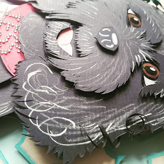


I like the idea of using small bits of paper to create an essence of fur around the dogs or cats. I also like how I am now creating more depth into my illustrations and also achieving textures of fur when using pens and pencils onto the paper with more confidence. It has been a good part of my new business as not only am I getting enjoyment out of giving people artwork that they love but also I am gaining experience and my paper illustrations are getting stronger every time I do one.
As well as doing my degree I've also been doing my side business which is Paper Pawtraits. I wanted to add this in as this has helped me to experiment a lot in creating different techniques to make 3D animals. Here are just some of them below:


I like the idea of using small bits of paper to create an essence of fur around the dogs or cats. I also like how I am now creating more depth into my illustrations and also achieving textures of fur when using pens and pencils onto the paper with more confidence. It has been a good part of my new business as not only am I getting enjoyment out of giving people artwork that they love but also I am gaining experience and my paper illustrations are getting stronger every time I do one.
Final Reflection
By looking at all my work I feel I have come such a long way in developing my style. I've always been into illustration but discovering my style has been truly a journey. I am very determined and I have created more possibilities than I thought I could achieve. I feel like I have really pushed myself and my ideas to create art that is now becoming more noticeable of my style and name. I am really excited to see where this takes me and how I can improve and learn different ways of using paper and my ideas.
Assignment Five - Seven Days
I'm really excited to start this assignment as I've been thinking about it for a few weeks now and what I want to do. As I have now had a chance to reflect and look back on things that drive me I am now going to research as much as possible until I get the best idea for me.

Ideas
I am now going to get my sketchbook and create some ideas of what I could do for this assignment:


As you can see above I created quite a few ideas. I didn't realize that I could think of so many as I thought I was going to struggle. I took five of my favorite ideas from my spider diagram and looked into them further they were:
Seven Days On Safari
I thought about doing a small pop-up book for children about going on safari. I thought that this book could be quite exciting as the children would open up the pages and the animals would pop out in this small pop-up book. This was my very first idea I came up with when I was thinking about the Seven Day title. I do know that people have always said don't go with your first idea, so this has made me a bit scared of doing this idea I looked into it further. Thinking about it more I have decided that I really Have not done much with creating pop-ups during this course, apart from my very first exercise which was to create a handmade card, and then again it was only a small pop-up which was very simple. It's a risk to do something different but as I've not done it previously, I felt too nervous to do it and wanted to show off my Talents that I have and my Ideas I have picked up along the way.
Seven Days Becoming A Hero
I thought this would be a good idea to educate children on how to be a hero during normal life, such as helping an old person across the road or saving a pet. Showing them that doing simple things in life and helping other people out you are their hero. They are grateful and you will be a hero in their Eyes for doing something good for them. Quite a few people when I told them about this idea we're saying yes that's a great idea to do and it is, but I want to look into other ideas to make sure I had the best idea out there for me.
Seven Days At Sea
For some reason I am quite warmed to illustrations to do with the ocean I'm not sure why as I can't swim but I do like the aspect of creating 3D waves with a ship and an adventure on the sea. I think this would be an idea for a children's storybook where a pirate goes on an adventure and each day he comes across an obstacle such as a giant squid, mermaids and sharks. Again here it was looking as though it could be a pop-up book or creating illustrations out of paper and using them for the story but I still feel a bit unsure of this idea as it's is what it says on the tin. I want to find something where I can give people a positive vibe and something useful to help them.
Seven Days And Their Meanings
For this I thought seven days? What can I do to show their meanings? I thought of perhaps creating a monster for each day and using the personality of each monster to show each day such as Monday is a gloomy day, when people have to go back to work. It's always been given a bad name and a bad vibe to it as it's the end of the weekend. So for example for this, I could make a monster, who looks grumpy and sluggish but then I decided that even if this was aimed at a child or adults it gives people that subconscious vibe that every Monday is going to be gloomy and miserable which in fact it's not.
Then thought about the 7 days and their meanings a bit further and thought that perhaps I should actually research into how each day got their names such as Monday - why did they call it Monday? and somehow educate people with this information. I thought this could be a really good and interesting idea. It's not going to be easy as creating a book on a safari trip as I am going to have to do research into it as I am not educated myself in this subject but I would like to actually understand it.
Seven Days How To Survive In A Forest
I also thought of doing a leaflet on how to survive somewhere like a forest if you get lost or take a wrong turning. I was thinking of doing a leaflet on what to pack beforehand in a backpack just in case this happens and also guides on how to make a fire, build a Hut to protect yourself and to follow the stars to guide you out of the woods. Again this is a good idea but I don't feel enthusiastic about it and it is something I feel that people who are doing this assignment would also think of doing something around the word survival.
A poem of Seven Days
My friend gave me a poem which is based on seven days of the week it's a lovely poem and I guess you would be able to do the illustrations for each day but the poem is to do with Christianity and I don't personally believe in a religion so again my heart's not really into this topic, Could make my own poem?
In my mind I had decided out of those ideas I was really interested in the Seven Days Becoming A Hero and the Seven Days And Their Meanings. To help me further I thought about going onto the Internet and having a look at the title Seven Days and see what other context ideas to see if there are any other ideas that I could be interested in.
In my mind I had decided out of those ideas I was really interested in the Seven Days Becoming A Hero and the Seven Days And Their Meanings. To help me further I thought about going onto the Internet and having a look at the title Seven Days and see what other context ideas to see if there are any other ideas that I could be interested in.
Internet research


Here Above are some of my images I found when I researched I can see that people use Seven Days for losing weight, training a puppy, trying to eat healthier and also used in a religious way. I even found a magazine that was called Seven Days. I tried to look into this further but I couldn't find out the reason why they're called Seven Days, however, the illustrations were cool on their front covers.
After having a look on the Internet and looking at my own ideas I really wanted to give the Meanings Of Seven Days a go and explore its possibilities. I've decided to choose this over the Hero In Seven Days idea as I think it's something very different and the days of the week are an everyday topic yet I feel people do not know the actual meanings of these days. It reminds me of myself using paper a typical everyday item and expressing to the world how it can be manipulated and understood in illustration.
Research into meanings of seven days
I'm now going to research into the meanings of seven days and see what I can discover. I am really hoping there is something here for me to work with if not I can always fall back on to my hero idea but I want to give this a go:
So I have Googled the meanings of seven days and have discovered that each day is represented and give them their names from planets in our solar system:
Monday is Day of moon
Tuesday is Mars
Wednesday is Mercury
Thursday is Jupiter
Thursday is Jupiter
Friday is Venus
Saturday is Saturn
Sunday is the day of sun
After furthermore research I discovered that Greeks also gave these days each a god to represent them and each planet also is bound to each god or goddess on that day.
Monday Selene
Tuesday Aries
Wednesday Odin
Thursday Zeus
Friday Aphrodite
Saturday Kronos
Sunday Apollo
Tuesday Aries
Wednesday Odin
Thursday Zeus
Friday Aphrodite
Saturday Kronos
Sunday Apollo
This really excited me as I have always been into the Greek mythology and their gods and goddesses.
I then discovered further that Romans defeated Greeks many centuries ago and took on the mythology of the gods that the Greeks had made. However they were not happy with some of the Greek gods so they changed them and created their own:
Monday Lunar
Tuesday Tiu
Wednesday Woden
Thursday Thor
Friday Freya
Saturday Kronos
Sunday Solis
Tuesday Tiu
Wednesday Woden
Thursday Thor
Friday Freya
Saturday Kronos
Sunday Solis
I was looking into this deeper and decided that it got more confusing and I have always been interested in the original Greek gods so I wanted to use those original gods and find out their meanings for each day.
I discovered the meanings of each day and then created a table which is below:


As you can see above I split a table in the days of the week, planets, the god or goddess that resembles each day. I discovered that each God has a symbol which I put in there and also a short description of each day's energy here they are below:
Monday is the day of the Moon - Selene is the goddess of moon and Monday sets the emotional tone for the week and to get a clear head.
Tuesday the planet is Mars - the God is Ares, who is the god of war and Tuesdays are about putting emotional tone into action and it's a great day for tasks and getting stuff done.
Wednesday planet is Mercury - God is Odin, who is the god of wisdom. Wednesday is the day of communication and expression this helps to get clear about what you want and to achieve further motivation is also helped on this day to help to create new ideas.
Thursday planet Jupiter - Zeus God of thunder. Thursday is a day of positivity and expansion it's a great day to learn and expand.
Friday planet Venus - Aphrodite goddess of love. Friday is about love and being creative it's a great day to relax and connect with others.
Saturday planet Saturn - Kronos is the god of time. Saturday is the day of taking responsibility and getting organized and also it is a great day to find your balance and be grounded.
Sunday is a day of sun - Apollo is the god of illumination and victory. Sunday is the day of relaxation unwinding and listening to your inner self.
Portraying my subject
Now that I have looked into this I feel really excited and happy that I've researched into something that I have found really interesting. what made it more interesting is that each day is named after a planet and each day is protected by a god or goddess which have given certain energies to help get the best out of each day.
I'm really excited about this idea and the next step to look at is ways that I could deliver this information to people:
I have thought about the following ideas below:
Poster A small book
Poster
Leaflet
A zigzag chart
Greeting cards
A fact book
Witcher light tarot cards with facts on
Postcards in gift Bucks
A comic
A film advert
Out of my ideas above, I would really like to do a set of postcards in a gift box I think this is a very interesting idea and something new to work with. I think this would create a great gift for people and educate them in the meanings of days and also how to make the most of the energies from each day, to help them be more productive in whatever they are into.
I think this idea is different and works well with my use of the Seven Day title. I think I would like to do an illustration for each God and put it on the front with maybe the day and on the back a paragraph of the days meaning, energy and an illustration of the planet. This is my initial first idea for the postcards but I will be researching more into this shortly.
There will be 7 postcards, one for each day and maybe an eighth one as an introduction to Greek mythology. Also, I would like to create the packaging to put the postcards into.
I think this will be aimed at 13 years old +. it is a subjective and factual idea, which I feel will cover most age groups above 13. I think people who are spiritual and interested also in the Greek gods and different mythologies will like this idea. It will be a unique gift even for people who never knew the meanings behind the names of the days. The next thing I now have to do is create a brief for myself and then research into the gods, their appearance, the planets and start getting ideas to make and help me Create thumbnails for each postcard.
The brief
Here is my brief below:

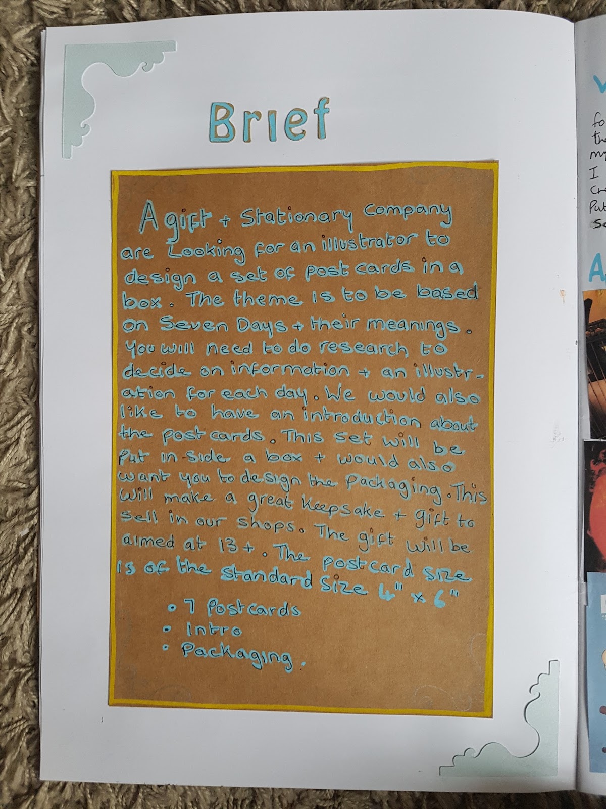
A gift and stationery company are looking for an illustrator to design a set of postcards in a box. The theme is to be based on Seven Days And Their Meanings. You will need to do research to decide on information and illustrations for each day. We would also like to have an introduction about the postcards. This set will be put inside a box and would also want you to design the packaging. This will make a great keepsake and gift to sell in our shops. The gift will be aimed at 13 years old and up. The postcard size is of the standard size A6
Further research into my idea
Here I am going to look at visuals ideas fonts and styles.
Ideas of characters
Here below are some images I have collected of all the Greek gods and how people portray them:

Apollo the god of the sun is seen with a bow and arrow and also his famous harp. He always seems to be topless or have a half piece of cloth wrapped around him. He has a glow about him which I feel represents that Zeus his father saw him as the Golden Boy in his family. They have used colours such as yellows blues and whites to create the contrast and theme of this god. My favorite one here is the one where Apollo is holding his bow and arrow upright with the sun behind his head. I feel this is the perfectly ideal way which would be easy for people to understand who he is and what he represents.

Selene the goddess of the moon is also seen with the bow and arrow and pictured with the moon behind her. The colours are different blue tones and slightly white glow around her and the moon. My favorite one here is where Selene is using a bow and arrow but the bow is actually the moon, this is a clever composition that has been used here using the moon and the character together.

Ares who is the god of war is pictured wearing armor with a helmet and usually carrying a blade and shield. He has a brave mood about him. The main colours they use for this character are reds and oranges. The best one that I liked on here is the cartoon character top right. The Style with the over-the-top helmet hair and his long red cape really gets his personality across.

Odin the god of wisdom is usually portrayed with a helmet that has wings on either side, he also has a beard and is quite old looking to show he has wisdom for many years. He reminds me of a Viking warrior with his visual features.

Zeus has a white beard and has a golden crown on his head. He's usually seen with his famous lightning bolts and again because of being a god type character he has a glow around him.


Aphrodite the goddess of love is seen quite often from my research, wearing pink and having blonde hair. She is said to be the most beautiful goddess of them all and people have made her look really pretty to get this across to the viewer. I like the image where she is standing and there are swans below her. I like the colours here the blues and the yellows seem to work really well together.

Kronos the god of time is a particular god who is a bad guy, so the colours are usually a bit dark and he is seen as an angry mean person because of him eating his children in his story. He again looks strong and carries a blade weapon to show his iconic looks about him.


Whilst doing the thumbnails, I discovered there is a lot of information that I needed to put down and questions in my mind to help me such as: am I going to have the gods up in heaven? or how am I going to show the planets the symbol and the gods all in one illustration for each day?


Here above are some more styles I picked up along the way I have a lot more in my mythology Pinterest link which you can find below that I had researched:
https://www.pinterest.co.uk/GemmaMlees/greek-mythology/
After this character research, there are certain factors that I like such as using blues and yellows as I think these are powerful colours to portray a god or goddess in. Also having the same style throughout the characters is an important key so that people can recognize who the illustrator is and they go together as a set well. I also like the symbols of the gods and want to portray them somehow in my illustration work.
Thumbnails
The next thing I'm going to do now I've had a look at the gods and goddesses is to start sketching out some thumbnails and work on getting a good layout idea/s that I am happy. I am unsure whether to do a separate illustration for each or do the same background but with each different god or goddess in. I'm now going to start doing my thumbnails:
Here they are below

I was surprised to discover actually how many thumbnails I could think of here are my top 3 favourites below:

I really like this idea I know it doesn't look much here but in my mind, I had an idea of some kind of throne or a temple and using a wreath with a banner with the name of the God. I think the wreath is a good idea as it suggests the Olympic era which was part of the Greek god empires story.

Here I used apollo's harp for the border of the character and thought maybe I could do this for each character using their item that they hold, however not all of the gods or goddesses hold an item so this makes it more somewhat challenging. I do like the idea of perhaps using temple pillars either side to frame the characters.

This was also another great idea where I would use a Greek pot and on the face of the pot put each God into it. I do like this idea but then the next step would be having to think how I'm going to display the planet based on each day and the front, will it all fit?


This was also another great idea where I would use a Greek pot and on the face of the pot put each God into it. I do like this idea but then the next step would be having to think how I'm going to display the planet based on each day and the front, will it all fit?
I am now going to test out my 3 ideas by sketching them in a bit more detail to see what I can come up with.
Here they are below:

I really like my ideas and think that they are quite thoughtout with the greek theme and style. Here above is the harp attempt and the pot illustration. I think they've turned out quite well and the gods fit in nicely. I do however really like the one with Apollo, the harp-shaped frame and using the banners to put the font on. I think that the pot idea is also good but now having drawing it out a bit better I'm struggling to see where I can put the front and also more illustration key points such as the planet and the symbol for each day.

For some of the fonts, I decided to put in my sketchbook and decide on which were the best


I have done quite a bit of research into the front Styles I picked out a few of my favorite ones:
Oh mighty one - which is a greek style which contains letters that are pointy and a common style found in Greece. I know this style will work well and fit in with my illustrations.
Hodor style font - I like this one as it is bolder then Oh Mighty but unsure if this will look right in illustrations it has points on every corner of each letter making a powerful appearance and the god are powerful which in that aspect would work well.
Vectroid Font - Is more of a space font which I thought may go well with the planets - The gods are also from up above so I wanted to try this out to see how it looks.
I was thinking about cutting the letters out with my cutting machine as that can also cut out fonts and perhaps it would all work out with the paper illustration so that everything is made out of paper. Some fonts that I was looking at looked too thin and my cutting machine would not be able to cut them out and struggle with them. I have gone for more of the thicker style fonts which I will look at again and test out once I have developed the illustration idea further. I need to provide enough room in my illustration for the font on the banners.


Another idea above I had is with the Olympic wreath and I was really happy with it. I like the fact that she is floating on a cloud in a temple that has a reef underneath and a banner with her name on and also above a banner with a planet behind it attached to the roof of the temple. I think this gives a really cool sense of a type of metaphor creating an air balloon style with the planet and where the goddess is in the temple on the cloud which could indicate the air balloons basket. Perhaps I could do this style for each of the gods and then change the god and the planet and the symbol depending on what day and God I use. I really like the composition and the idea behind introducing them to the viewer in this unique idea.
Fonts
Now I have got a sense of my idea of the illustration I'm now going to look at some fronts that I could use to help with the theme that I am thinking about in my head. I really want it to be a greek kind of style and a god like essence and mood in the illustration.
Here below is my link to my Pinterest for the fonts I had been browsing
https://www.pinterest.co.uk/GemmaMlees/greek-font-styles/


Oh mighty one - which is a greek style which contains letters that are pointy and a common style found in Greece. I know this style will work well and fit in with my illustrations.
Hodor style font - I like this one as it is bolder then Oh Mighty but unsure if this will look right in illustrations it has points on every corner of each letter making a powerful appearance and the god are powerful which in that aspect would work well.
Vectroid Font - Is more of a space font which I thought may go well with the planets - The gods are also from up above so I wanted to try this out to see how it looks.
I was thinking about cutting the letters out with my cutting machine as that can also cut out fonts and perhaps it would all work out with the paper illustration so that everything is made out of paper. Some fonts that I was looking at looked too thin and my cutting machine would not be able to cut them out and struggle with them. I have gone for more of the thicker style fonts which I will look at again and test out once I have developed the illustration idea further. I need to provide enough room in my illustration for the font on the banners.
Character design
Here below are my characters I've designed based on the descriptions and visuals I have found from my research for each character.

I have kept them all in a similar same style with their faces with a line down the middle. This is because I'm going to make them out of paper and one side of their faces light and one side of the face is dark to get contracts to help with the 3D effect in my work. I tried this in a portrait I recently did and really liked it here is the image of it below so you can understand what I mean:

I really like my style of the characters they all have a similar face style and I think they work well together. It was well worth researching each to discover their personalities, background stories and possessions that show what people think of when they think of a particular got such as Zeus and his lightning bolts.
These are my initial sketching of my characters and I will do more a bit further on. the next thing I really want to do now is just getting my overall main illustration area right so I can work around it.


Here below is my research for colours For my illustration:

When looking on Pinterest and on the internet I wanted to go with a greek coloured style which ranges from blues and whites, a very Mediterranean kind of theme. I also think that a blue theme would work well with the gods and having a glow yellow affect around them. This is my idea of how the Greek gods look in my mind. These colours will create a powerful and gentle mood and atmosphere. I look at them as the same as angels with a glow of goodness around them and using blues to take that idea they are up in the sky. It also creates a calm, happy and heroic visual for the viewer.
Here below is my link to my Pinterest so you can see more of my mood board and how I came across these colours


I really like my style of the characters they all have a similar face style and I think they work well together. It was well worth researching each to discover their personalities, background stories and possessions that show what people think of when they think of a particular got such as Zeus and his lightning bolts.
These are my initial sketching of my characters and I will do more a bit further on. the next thing I really want to do now is just getting my overall main illustration area right so I can work around it.
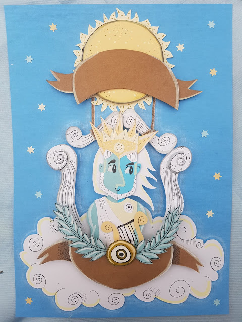
Final Main Illustration Design


As you can see above I have practice quite a few different layouts and compositions for my illustration area I tried using different ideas to make the illustration look as clean as it can be. I tried placing the banner on top of the roof then I tried putting the planet below the banner instead of above it and also tried using wings instead of the wreath at the bottom. I'm glad I attempted to look at this a bit more as I came to realize that I still really like the idea of the planet with the banner being a bit higher than the roof to look like an air balloon style as though the planet is holding up the god on his little temple cloud basket.
The bottom image is my final design for my main frame of my illustration In this I am going to use this across the seven days and change the symbol, the planet and the god or goddess designated for each day. I think my design is very thought out and goes well with the theme around the gods and goddesses of the days. I also feel as though I have left enough room for the font. The next step I want to have I look at his colours and making sure I am happy with them and they make my illustration idea stand out to its best.
Colours

Here below is my link to my Pinterest so you can see more of my mood board and how I came across these colours
https://www.pinterest.co.uk/GemmaMlees/assignment-5-colours-seven-days/
In the photo above on the left-hand side, I went through the papers that I have got at home and picked out the best colours which will work well for my illustrations. I picked a selection of blues out, a light creamy yellow, a yellow and brown. I think these contrast well together and will make a powerful effect on the gods and goddesses to be portrayed in.
Here below is my tester of the colours quickly just to see how they work together:


These are the designs of the planets I've had a look on the internet for each planet and I have come up with a line drawn image for each one. These are based on what I saw and how I feel each planet looks in an illustrative way. I think they are very fun and are going to work well with my characters. I am going to do some smaller and some bigger than each other based on the actual sizes in real life. Saturn has a ring around it so I will have to work out how this is going to work with the banner that will also be over the top of it. I want to be able to make sure the viewer can see the ring so they can understand what it is.


I have now started putting it together onto the blue background that I have chosen for the sky. I have drawn on textures and lines to create the cloud and the wreath and also drawn in the symbol to test out the size to make the actual symbols properly later on.


I have been quite careful when putting my illustration together to keep checking out my original line-drawing and making sure each paper object is aligned correctly. I have also now added the wreath with the symbol area and added lines and texture using my black graphics pens, pencils and posca pens.

I am really excited about how this is coming along and I think that it is going to work so well and I'm excited to see them all together with each different god or goddess and planet and symbol to represent each day. The colours in my tester are just as how I imagined and because I have done a lot of research it has helped me more easier to decide on where those colours should go to bounce off each other.
I think the composition is great and my idea that using the same one illustration but then changing the characters etc for each photo is a great unique way when working using 3D paper instead of having to keep redrawing the same illustration over again. All I have to do is change the characters and some parts of the background to make completely different individual illustrations.
Final images of planets and characters


Here above are the final illustrations of my characters. I think this has made me really excited about this final as I can see how far I have come with my research and thinking about the meanings of the seven days. All my characters look that they are from the same style and all fitting well to their descriptions that I have researched over the internet and in books. These will be cut out of paper and put into the middle of my main illustration frame that I will be creating.
Now that I have confirmed my final characters and the planets and I know what my background design is going to be, I am now going to do a final line art drawing getting the proportions and sizes right of the air balloon temple on the cloud.

As above you can see my final line art drawing of the temple and the cloud. I tried to do it as symmetrical as possible but still wanted it to be slightly different in the Cloud area I think this is now looking really smart and clear and I am completely happy with my final image here.
Creating My Illustration From Paper
I am now going to start cutting out all my shapes for the background and the Temple on the cloud
Main illustration Area
Here are some images below, showing parts that I have cut out:


As you can see above, I've cut out all the parts that I need to create the temple I have also started to cut out Selene the goddess of the Moon.This is just to make sure at this early stage that the illustrations I drew fitted into the temple correctly which she looks like she does so far. All the god characters are of a similar size so there should not be any issues.


I really think my illustration is such a great idea and is coming along beautifully the 3D effect helps it stand out from the sky and also I added stars in the sky which I used a paper cut out a star template to help me. In this area, I feel that using the stars with the same tones of yellows and blues in my illustration work well. I also used pencils to start adding a glow to the cloud and the pillars. I think this gives it a great sense of magic to it and I'm now looking forward to doing the next part.
Planets


The next thing that I have done is designed all the planets as you can see in the photos above and cut them out. With the Planets next to the illustration, they look as though they match the style and are going to work so well! I've tested them all with the banner on top and they all seem to fit well underneath it. For the planet Saturn which I was worried about the ring I've put the ring slightly higher than it should be and it will still make a good effect and the viewer will understand and see what it is.


Image above showing parts I have had to cut out to make Zeus.


Above the process of gluing together and adding detail to create Zeus.


I have now as the above photos show designed all my characters out of paper I was really in the zone here so I took photos along the way when remembering to.
Planets


Adding detail using agoldd pen, fineliner and a white posca pen.


Image above showing parts I have had to cut out to make Zeus.


Above the process of gluing together and adding detail to create Zeus.

Above photo is the middle of creating Odin.

I am really happy with the outcome of my characters they look just like the line drawings but now are even better with the lovely colours that I have chosen for the theme of my illustrations. I think they look very godlike and also they all look in the same style which is fantastic. I used an ivory posca pen colour to add highlights to each of them around some of the edges which help with the essence of the glowing god/goddess form. They also go well with the planets and I am excited to get started to put them together to see how they look in the main area of the illustration.

I have also done my symbols as above to change these in the wreath for each god or goddess that I will be using in the illustrations. All I have done here is cut out circles and put the symbols on and used a gold pen to highlight some of the areas to make them stand out.

Here's an image showing all the planets and the characters together to show you how they look on top of my sketchbook original line drawings the sun is smaller and a few other planets but this is because I had to make sure they fit into my illustration and not look squashed I've tested them all out and they all fit perfectly.


Here above are my final illustrations that I have taken photos of with each god, planet and symbol for each different day of the week. I am really happy about how these have turned out and feel that my idea has worked well even with using the one illustration of the air balloon temple and then creating seven separate characters to put within that temple. It is a very clever and less time-consuming way but also still an effective way of doing this illustration to cover Seven days. I absolutely love the colours and the whole thing is now coming together which looks fantastic. The illustrations look good quality and my paper cutting is very neat and tidy. I am so glad that all that hard work in researching has paid off to finish my illustrations for the front of the postcards.
I'm now going to put them in Photoshop and have a play around to add a bit of more depth to them maybe try and make them a bit more brighter and also add the front on to them.


I have also now picked up the scraps and trials and errors that I attempted and have put them into my sketchbook for you to have a look through there are some areas such as the banner which I tried to do at the bottom and it ended up being too thin, so I thought that this would be a bit of a struggle when it comes putting the font in place. I also tried out tonight my cutting machine to cut out the letters to also make the letters out of paper but the machine was having technical issues and kept eating up the paper so I'll have to look at this in the future when thinking of using paper to have letters made out from. So I am now thinking more towards when my illustrations have finished I will use Photoshop to put the font on.
Photos Of Final illustrations
Here below are my final designs for each illustration:
Selene - Monday


Ares - Tuesday


Odin - Wednesday

Zeus - Thursday


Aphrodite - Friday

Kronos - Saturday


Apollo - Sunday


I'm now going to put them in Photoshop and have a play around to add a bit of more depth to them maybe try and make them a bit more brighter and also add the front on to them.
Here are my final illustrations below:


The next thing for me to look at now I have my post cards completed is to create the packaging and design the front and back areas of the box as well as creating the introduction page to the post cards.
I decided fist to creat a simple box idea to put my postcards in to:


For the front of the box as above, I wanted to still keep within the theme and use the Pillar temple on the cloud to advertise what it is. I used Photoshop here to get rid of some of the top areas where a banner was in the photo and also again added a glow and some shooting Stars into the background. I still kept to the same font which still looks great and in the middle of the temple, I put what the seven days topic was about. I think this is a very bright packaging statement and works really well with the postcards that I have created.


After using Photoshop and playing around with the colours, I am so happy about the finished illustrations. They now have a more vibrant colours and I also managed to use Photoshop to improve the glow effect around certain areas such as the cloud and the pillars I also used the burn tool to make the banners a bit more golden and darken and some areas of the blue background.
I tried my three main font styles and in the end, went with Oh Mighty One. It came across more clearly than the rest whilst keeping to the theme I have got going on. I think the font fits well in each area and I made the name of the days larger than the names of the gods or goddesses as this is the most important key to the whole idea of the postcards.
I think they all work together very well the compositions are great and it's such a clever idea of using the planet as an air balloon style for each illustration. I think the illustrations portray to the viewer what I'm trying to get across showing them the day the meaning behind the day with the planet that it was named after, the god which guards the day, the symbol and also trying to get each God's personality across in the character designs. I have also created some white glow coming from the stars creating shooting stars in the background. I think this finishes them off really well I am really happy with how they have come along and they have a very unique to style to them.
Back Of Postcard
Next thing I did today was look at the postcard background designs now that I have finished my illustrations, it was quite easy to sort out the back of the postcards. I looked at an old postcard I have got and added the main areas which are standard items such as an area to fix a stamp, an area to put an address and an area to put a message on the back. For each one, I also wrote a paragraph for the meaning of each day, a bit about the god or goddess and again I also put the symbol of the god or goddess onto the back. The symbol and the paragraph about the day helps both sides of the postcard connect to each other and helps give the viewer an understanding of the energy and meanings for each day. I also used the same font which makes it a good flowing product. I think they look really great and they give motivation and inspiration to those people who read them. Here are some of the backs of the cards with there meanings:


Packaging
The next thing for me to look at now I have my post cards completed is to create the packaging and design the front and back areas of the box as well as creating the introduction page to the post cards.
I decided fist to creat a simple box idea to put my postcards in to:

Above is a photo of some quick sketches I did to create my box design, I already had an idea in my mind how I wanted it and created a kind of small flat rectangular shaped box for them to fit. it is not too big keeping it small and snug to the postcards. This will make a great gift and an ideal size to put postcards in to sell.

Here above I screenshot my box design in my silhouette paper cutter software which I used to make the box.
Packaging illustration Design

Back of box

Introduction To Put In Box

Above is the back of the box that I have created which is just a small introduction to the postcards. I've also found a barcode and put a bit of small print information on there about the Gift Company that this product is made for.
For the introduction card, I have explained how these cards can help motivate you and inspire you and also your friends and family who you send them to. I have briefly explained a bit about the gods and their meanings towards the seven days of the week. I wanted to try and keep it as short as possible because on the back of each postcard it explains more than enough for each day that is needed.
Here are my final photos of my finished product
Font of box


Front and Back of box


The opening of the box with tissue paper inside to make it more delicate and a special cherished feeling to the postcards.


Box Contents

Showing all postcards out of the box with some showing the backs of them with there descriptions.


Reflection, conclusion and overall thoughts about my approach to Assignment 5
After now looking back at the beginning of this final assignment to now where I have the product in front of me, I can see how by following the process I have learned in Illustration 1 can help your ideas improve, progress with research and become a strong piece of work.
I think my overall idea is really good as it is something I have not seen another student do. I have taken on the task of using the title Seven Days and created an idea which is educational, subjective and fun for viewers to learn and use in their daily lives.
My illustrations have turned out so well and I have really grasped the atmosphere and mood I was going for to get that magical heroic sense of the gods.
When looking at the final images above I can see real potential in this actually being a product that a gift company would sell. I have followed the brief as best as I have could and I think the gift company would be very happy with my idea. I also think it suits the age group 13 plus as they are easy to understand but also people can take the information given as how they want to and use it to help motivate and inspire them. I think giving the viewer something that makes them feel good also helps the popularity of my postcard set.
Looking at the finished product is so exciting and joyful to see something you have come up with becoming a finished product that people will enjoy. The box, intro, and postcards look amazing together, they work well and adding the tissue paper finishes the whole overall special unique look.
I love the colours I chose and they all look beautiful and uplifting and help to capture the god's ambiance.
If there was anything I would change I maybe would look at the banner my the planet again, as it keeps reminding me now finished of the Walkers crisp packets and the design they do on the front of them but that is the only thing. I think they are perfect and I have made a great job well done with the illustrations.
Overall in illustration 1, I have come a long way I love my paper syle and there is still loads to learn and improve to become more successful. Now I know my style I can work from there and explore other ways and ideas to improve my it but also to show myself through my work like I feel I have done so in this final Assignment.