Exercise: Text and image
For this exercise, it is about learning how to use words against each other and how to make a word look, based on its meaning. I have been given five pairs of words which are below:
- big, small
- fat, thin
- fast, slow
- fun, boring
- calm, mad
I now need to write each pair of opposites in a way that is descriptive. I'm going to look at the shapes and sizes of the words relative to each other and express their meaning within the typefaces.
Here are my examples below I have done in my sketchbook:

As you can see for example; Big and Small, I have made the big look bigger than the word small. Another example I have done is fast and slow, where I have made fast look as though it is moving and slow I have created wobbly long lines to make the word long and look slow.
The next thing I need to do is to go onto my computer and pick out some typefaces that relate to each word that I have been given and decide on which I feel is the most appropriate and that people will recognize the shape through the words.


Here are my tryouts above. I printed out the fonts and traced them and used different colours and other ways to manipulate them to get the meaning across.
I also did a little test where I got each pair of words and swapped the typeface around so now the word big was small and in my small typeface and the word small was now in my large typeface and larger than the word big. It was interesting to see how different a word can look and change the way you think of it when looking at it.
I am enjoying actually looking at this exercise and thinking more so about the font and the typeface which I have lacked in areas of my work previously. I think this has been a bit of an eye opener as to how to go about front and typefaces when you are creating an illustration with words.
The next part of this exercise is to again use each word and create your own typeface style using pens pencils and other medium to experiment creating the typefaces for each word here are my attempts below;

I feel like I have created some really good ones I like my typeface for the word fat as I have used hamburgers and the front is wide so it's still shows to the viewer the word meaning I'm trying to get across. I also like the opposite of fat, the word thin which is tall and skinny and used the colour green as it is a sign of being healthy.
I liked the word mad as the dots inside are rising up to show how anger gets worse and worse before it explodes. I have also used red here to play on the anger colour.
I think the hardest word to make a typeface for, for me would be the word calm. It was a tough word where it needed to look relaxing and tranquil. I decided to go with a plain front but then use pastel colours, such as the green and the soft beige to make it calming. I also use dots underneath the word calm which gives a sense of pause which perceives having a relaxing moment.
This was a fun exercise to help show and understand ways of using typography and their meanings to come across in illustrations. I will be and have been trying to think of this more now when I am doing illustration work and I am hoping it is starting to show.
Exercise Packaging Illustration
I'm really excited to start this exercise as I've been looking forward to it. For this exercise, my brief is that I have to create illustrations for packaging to be used for a new range of organic biscuits for children. There are three varieties in the Range which are raisins, chocolate, and ginger. The client wants three illustrations featuring extinct animals interacting in some fun way with a biscuit to be used on the boxes the drawings should be in full colour. The client would like the colours to reflect the flavour of the biscuit.
Also, it states that it will be probably an adult who makes the purchase of these biscuits, so I need to decide whether I will exploit it as 'pester power' or appeal it to both adult and child. I may want to develop the characters suitable for young children or employ a style of drawing which will be an appeal to all the audiences. I will also be able to decide whether it will be hand drawn or straight typography in the illustration.
And finally I have to submit all stages of development process including thumbnails and visuals for all three designs and a final markup for at least one of the ideas.
Now I've got my brief I an now going to do some spider diagrams and think of some ideas and the types of biscuits that have been chosen. I am also going to look on the Internet and research the market to find out how I can get my ideas to stand out amongst the competition.
Here below in my sketchbook is ideas and some competition images I have collected:

I have created some spider diagrams just to figure out some of the extinct animals which I would like to do. I thought of dinosaurs: T-Rex, Stegosaurus, a mammoth, ground sloth, Dodo and others. I have also looked into the biscuits to get the aspect of the colours at this early stage. For the chocolate chip cookies, it would be yellow, brown and dark Browns. For the raisin cookies, it would be black for the raisins, cream and yellow and finally, for the ginger biscuit, it would be a rich orange with Brown's and yellows. I need to also capture textures of the biscuits which are crumbly there are lumps of chocolate, raisins hard crunchy and crunchy.
Also, you will see the images I have collected for competition. In the market, Cadbury's create chocolate biscuits called 'Mini animals'. These are I think the closest thing to what the brief is asking for using the cookies on the front of the pack. Cadburys illustrations show the animals made out of the biscuits. I couldn't really find much else to do with biscuits, however, I did come across some cereals that also use extinct animals such as the Quaker oat packaging, with the dinosaurs, claiming that there are dinosaur eggs in the porridge. They have used a typeface, which makes it look caveman style and the colours are bright and playful these would attract children to buy them. I think this company have used a pester power approach for their product. I also found some random items with other extinct animals on which was the dodo such as the pizza boxes and the cans of beer. I know these aren't packaging as to what I'm looking for, but I wanted to look how they illustrate some of the extinct animals. What I'm going to do now is try and become more confident in drawing some extinct animals. I am now going to just pick my top favorite animal ideas from my spider diagram and just have a play about to see how they come out.

As you can see above I have illustrated some quick sketches of my choices. I do like my T-rex and the dodo. I think the next thing to get started is I need to look at is picking a name for my biscuits and choosing a typeface:

Here above, you can see in my sketchbook that I have written a list of names that I came up with I did like 'Dino Rocks' and also 'Dino Crunch'. I have attempted some typefaces and some of them I've used bones to a show prehistoric typeface and also I have put biscuits into the typefaces to show what the product is about. I also like the idea of making 'Dino Crunch' look like it has been crunched up with cracks and nibbles out of it. I thought of an idea whilst doing this of having the dinosaur eating the word crunch in his mouth as in the image above.
I have decided I am going to call my biscuits 'Dino Crunch' as I think I can work better with this title and produce better ideas.
I'm still indecisive about my typeface styles. What I'm going to do for now is move on and do some thumbnails using my different types of typeface and see what I start to like more or I may create a better idea.
Here are my thumbnails below:

As you can see I have played around quite a bit with different dinosaurs either chewing on the biscuits, fighting with the biscuits and even a volcano erupting and using the biscuits as rocks coming out of the eruption. I thought of various different ways that I could illustrate the dino/s enjoying the biscuits. I still need to look at creating my dinosaur character. To be honest I am still unsure about my idea. I still feel I can do better and want to create something that is unique and different to whats out there which will grab peoples attention.
I am now going to just sketch some ideas out for a character and see how it goes and maybe this will help me to decide on what I want to do.


Here above is an image out of my sketchbook of my character designing and my whole idea has actually changed. I had a few days away and have come back to it today with a fresh head. I was not really in the dinosaur idea, but was struggling to think of what I could do to improve my idea to make me feel its the best I can do.
Luckily I had a breakthrough! I was drawing another dinosaur at the bottom of the sketchbook but it ended up being a Dodo which I can actually say is brilliant! I love the way I've sketched him out he is such a happy fun little chap and I really think he would be great on the packaging. He reminds me somewhat of the Minions out of the Minion film who are a bit silly and also quite fun and entertaining to watch. I am so much happier with this character and think a Dodo is something different and more unique. I'm now going to start again and look at the name of the biscuits the typeface and find out what style I want to go with.
Luckily I had a breakthrough! I was drawing another dinosaur at the bottom of the sketchbook but it ended up being a Dodo which I can actually say is brilliant! I love the way I've sketched him out he is such a happy fun little chap and I really think he would be great on the packaging. He reminds me somewhat of the Minions out of the Minion film who are a bit silly and also quite fun and entertaining to watch. I am so much happier with this character and think a Dodo is something different and more unique. I'm now going to start again and look at the name of the biscuits the typeface and find out what style I want to go with.

I've written some notes down and for my idea with the Dodos. I've decided to call my biscuits 'Dodo Bites'. I think this name fits in well with the Dodo's and is also really fun for children and adults. I have above done some typefaces and created some really funny ones. I like the bamboo one where it is choppy bits of bamboo stuck together. My favorite one is the one that looks a bit bizarre which I feel resembles Dodo's really well. It is a style using a black biro with lines and then swirls and bits of leaves sticking off certain letters. Its quirky, clear and fun to look at .I'm really happy with my typography and it goes really well with my character design.
I have also looked at colours for each biscuit type. I think my colours are going to work really well together. I wanted a limited palette to portray the biscuits but also colours that would go with the extinct theme.
I am now going to start doing some thumbnails and some ideas to create some fun scenes with a dodo or more to see what kind of ideas I can come up with.


Above is my thumbnails and ideas of my Dodos. I had so much fun using my imagination creating different funny ideas. I like the idea of having Dodos together one biting the other as their body is made out of a cookie. I looked also at the history of the Dodos and they are known for their silly personalities so there were different ways that I wanted to portray this using the biscuits which made it fun. Such as standing on top of each other, chasing each other, fighting over a biscuit, playing with one and giving a cookie to another Dodo as a romantic gesture.
Above in the thumbnails, I have gone around some in brown which are the ones that I liked the best. From these, I have decided to choose three of them for the different types of biscuits. My favorite one is where a Dodo is on top of the other Dodo but in this sketch, I've done it as the Dodos holding a biscuit. However, I want to do it so that the body of the Dodo's is the cookie. Also, like the one where there is one dodo upside down and the other one normal with the biscuit in the middle of the heading 'Dodo Bites' on the biscuit. My other final idea that I liked was to have a dodo looking down a biscuit licking his lips.
I think these three ideas and will be really fun and great for kids and adults too. I'm now going to draw out my top three ideas and colour them in to see what they are roughly going to look like.

I have now done my rough sketches in colour and I am so happy with them they are just what I imagined fun happy and exciting. They make you want to try one of the biscuits because the illustrations look so bright, fun and exciting which is enticing you to try them. I love the colours I've used the limited palette which works really well together. Adding the bright yellow to leaves in the background makes it have a prehistoric character to the world in which they are in. It finishes off the illustration well as though there in a jungle somewhere. So now what I would like to do is create line drawings for each of my final ideas and then I shall pick one to create for my final illustration idea.

As you can see these are my final line drawings. I am really happy and think that my ideas are really thought out from doing a lot of research. I have also looked and there's nothing on the market that looks like these using Dodos to entice children and adults to buy cookies. Looking at these three I have decided that my illustrations are fun for adults and children and I think that all ages will find them enjoyable and want to purchase them. The typography I have used works so well and with the illustration and I am so happy as It all goes together superbly. I have asked a few of my family members who have been around tonight and I have asked them each which one they would prefer seeing in the shops the majority said that they were all really great but most of them picked the middle one with the two Dodos standing on top of each other. This is also my favorite one, so I am glad that the majority picked that one. I am now going to prepare to create this as a 3D paper illustration for my packaging idea. I am going to select the papers I have to the colours as close as I can and start cutting the different shapes out. I am so excited to see the finished illustration.


I am also going to start sticking the parts together and creating a 3D effect with their faces bodies layering over one another I need to also create the background and the yellow leaves are going to be cut out and stuck on to create a 3D backdrop
 Hear above you can say that I have no stuck some of the items down but also wanted to show that I have also thought about using crumbs of the biscuits in the background using the colours that I have on my limited palette I think that these had a bit of character to the background then leaving it blank with large space areas


Here below is my finished illustration


I think that this for me is one of those illustrations where you just get so excited about what you have achieved. I love all the colours and my characters look amazing. I think actually in real life this would be great packaging for a biscuit Brand and definitely, people would buy them off the shelves. I want to point out that doing the typography hand-drawn was still a good idea and makes it look more natural helping bring across that these biscuits are organic and the whole packaging really needs to look as though it is recycled and being world friendly.
I know want to go a step further and actually create the packaging and add on my illustration with other bits of information to show the consumer
I have looked on the Internet for packaging ideas and here's some I found
I have sketched some packaging ideas below of my own:

I really like the tall box idea as it is something different and biscuits usually come in plastic packets or flat boxes. I think this packaging is different and the style I have in my mind is like a little brown bag made of recycled packaging. I think inside the box the biscuits would be wrapped up in some foil tight casing to keep them fresh. Having not looked around and tested some ideas, I have decided that I am going to use brown recycled cardstock, as I think this will work well with the illustration bringing my packaging idea together.
I have been lucky enough to purchase a silhouette paper cutting machine this machine is probably going to help me so much and improve my work greatly you can draw your ideas and scan them in the computer and the cutting machine will cut out the shapes for you out of your paper. I'm going to use this to help me cut out my packaging design and bring my work together. This machine is really opening my world as well as cutting out, it can do dotted lines to help you bend pieces of paper easier and also there is a library of already pre-made shapes such as circles and squares to help you start off. It may take me awhile to get used to this machine, but I do think it will help me in the future with my 3D paperwork especially the timescale it take me to make my art.


The is my final packaging design with my illustration:


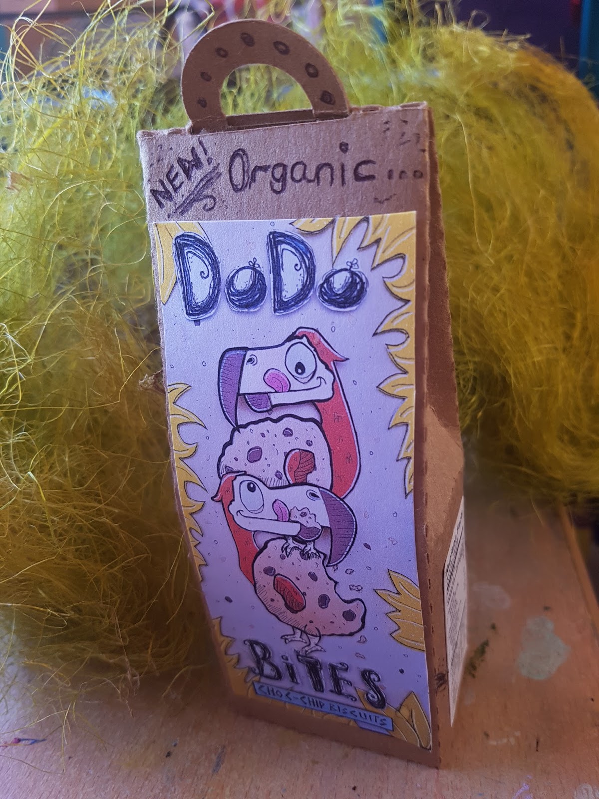

This exercise has been such a thrill to do. I think I have grasp every area of what the brief was asking for. I researched a lot and can see how I have come along to creating my final piece of work. I think it looks great and will entice adults and children to but the product. The whole packaging recycling idea works well also making it a natural product with organic cookies inside. I like the type style that I created and overall the whole Vision works well. I did start off struggling with an idea using a dinosaur at first but I am so glad I did because I feel my dodo idea is something original and works so well with the character of the biscuits.
My New idea - Paper Puppets
Recently I found a book in a charity store called Paper Puppet Palooza.
It really inspired me that as well as doing 3D illustrations I could also have a go at creating puppets out of paper. I had a look through and really liked some of the ideas such as the dancing ballerina and I even came across a dodo but even looking through this book it got me excited thinking about paper theatres and how to use paper to create characters and make shows with your creations as it's October I decided to do a few testers and to see how good I am at making them here are my ideas and finished items that I did:


I really enjoyed creating them and they are so cute and funny to look at I use brad pins as a form of connecting the limbs together so they can move and also I had an idea of purchasing mini magnets so I could stick them on the fridge to enjoy. I sketch out the designs first and decided which parts needed to be separated and then made a final image to create the overall puppets. I am really excited about this new venture with puppets and I shall be doing more in the future and seeing both ways that I could improve them to make them more my own style I have looked on Etsy and there is this lady who also creates paper puppets and she just uses brown paper and illustrates each of them individually. She is sending hers for about £30 average per puppet which is a real eye-opener as obviously its original art you're paying for this gives me a great idea to create some more and put them on Etsy myself to see if people are interested in my style. I will keep you informed on here and will experiment further to create more ideas.