Editorial Illustration
I've had a look through and there's actually only one illustration in the whole newspaper. I have also got a newspaper which is from the Association of illustrators company. I have looked in there and again have only found one which has an illustration so I have got two to work with. I will now investigate both of them below:

This one was out of the Metro newspaper, it has an illustration of a car with a racing driver at the wheel and it is looking as though it is moving at a fast speed. The car is red and there is a background which is a cream colour with black and white checkers for the racing typical flag theme. The heading of the article is pushed to the left-hand side with each word on a different line in bold.
I think the font is very eye-catching and shows to the viewer a more manly Style which would really grab the male viewers attention. The car illustration looks as though it's going at a fast pace due to white lines swiping at a perspective view from the wheels to the back. The racing car has got his headlights on which are beaming towards the headline 'The Need for Speed'. This is a good composition as the viewer's eyes follow the line of speed from the racing car to the line of the beams of the lights which is like an arrow pointing to the headline of the article.
I have read some of the article, it is informing people of a festival for racing cars it is called the Goodwood Festival of Speed, it mentions about getting up close to some iconic cars, watching cars go round the track with races throughout the day and different motorsports games that people can enjoy.
The heading of the festival wants people to realise that this is about racing cars that go at speed even the title has got the Need for Speed as the wording. The illustration of the car works well because it is a race car yet it is also moving at a fast speed.
This goes well with the article and you can understand clearly what it is about before you read the article it is more of an informational article it doesn't use a metaphor to convey an idea but it does have a type to picture grouping due to the title the Need for Speed which is telling the viewer that this event is a fast exciting event it is not abstract or diagrammatic, it is more representational as it is for information to give to the viewer of an exciting event coming up.

This next one is quite a good one and I enjoyed looking at it. First of all, the header is the word 'cheek' and it has an exclamation mark next to it. The illustration is a man without any trousers on showing his bottom. The title is a metaphor to the illustration where his bottom cheeks are visible. It is a fun and interesting way to grab the viewers eyes to read the paragraph that is underneath the headline.
The paragraph is talking about how the Association Of Illustrators provide an online base where you can have a portfolio. There are a few words that play towards the illustration such as 'bare' and 'body' which I presume the illustrator has looked at and picked on these words to create a good idea about a guy with his naked bottom. The illustration and the headline go well together but the paragraph does not really relate to it. I think in my opinion that the illustrator has used the headline and the illustration together well to capture people's eye, to then read the paragraph about portfolios online.
Even though the paragraph is not what the headline is about but because of the headline and the illustration, it really does make you want to read it to see what it is all about. The illustrator has done really well here and grabbed a good idea to get people's attention. I think this illustration is partially decorative but yet the paragraph is informational it definitely is a metaphor when used with the headline and I think again this illustration is representational.
My Brief
The next part of this exercise is now I have to imagine I've been commissioned by the paper to create an illustration. There are a few headings to choose from and I think I am going to pick the one that is 'Paris, still the best place on Earth.' I can relate to this one, as I have been to Paris a few times and it is a really good place to go when you are being a tourist. I think I could make a great illustration for this to go into the paper. What I need to do now is write an article based on this headline to work to show what my illustration will be about.
Here below is my article I have made up:
Here below is my article I have made up:
'Paris has been awarded a world Award for Romance 2017 it was declared that people voted from 50 countries and nominated Paris has the most romantic place on Earth. The survey results showed 15000 couples got engaged in Paris and 11500 got married there and the survey also showed 7 million had taken their partners for a romantic getaway. The spokesman for the world union says there are so many beautiful sights in Paris it is a great place to spice up the romance in your relationship or get down on one knee for the brave! The best and busiest time to do a trip is for Valentine's Day but make sure you take an umbrella as it is in the rainy season.'
So now I have an article to go with I want to show Paris and love in one illustration. I'm going to try some layouts for my article and also some illustration examples to see what I can come up with:


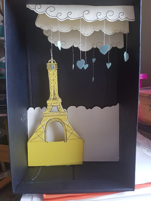
As you can see above I have created a lot of rough and quick thumbnails. I have really thought about my presentation and composition of my idea. I've decided to do in the background the tower and two people in a relationship sitting on a wall. Whilst doing these thumbnails, I then decided that the man should be proposing to the woman to go with my article and the survey results I want my illustration to look romantic and portray Paris in the right way.


As you can see above, I have now done the article and also the final image of a line drawing illustration that I want to do. I am really happy with my outcome, I really like my heading that I've used for Paris with a heart over the I. I think this type is very suitable for my illustration and goes with the whole overall article I am really excited about the swirly clouds in my illustration and also the couple sitting on the wall. My idea is to make this out of paper with depth as though you're looking into the scene. The next step for me now that I have decided on my final illustration and my article layout is I need to sort out the colours in the illustration. My thoughts are to keep them simple and using the colours that represent France which is blue red and white. I am now going to scan in my illustration and print it off a few times to test some colours out together.


I am now going to test out some layouts and ways I can make my illustration 3D:


As you can see here above, I've used a circular wooden disc and on top, I have been building up my scene just using scrap bits of paper. This is just to get the vision of how it is going to look. The only issue I think with this way is it is going to be very fragile and even when I want to post it off for assessment I am worried that it will break as it is circular and there are no barriers around the sides to protect the paper illustration.

I have been looking in my art room and have actually come across the Shoebox. I instantly thought that this would be a great idea to put my story illustration into and I am now going to test my illustration again with this scrap paper just to get a visual idea of how it's going to look:


I have been looking in my art room and have actually come across the Shoebox. I instantly thought that this would be a great idea to put my story illustration into and I am now going to test my illustration again with this scrap paper just to get a visual idea of how it's going to look:

As you can see above the Shoe box with my experiment, I feel this is going to work really well the scrap test has given me an idea of how the depth is going to look into my illustration. I think this is going to work really well.

The next thing I have done is looked at my colours in my chosen colour guide illustration and found papers that match these colours to use in the final illustration. I think the colours work well together and I like the tones of blues and whites and creams working together


I have mixed purple and blue to create my Midnight Blue and I'm excited about this colour and I think it'll work well together with the blue tones
The next step is for me to start off with a certainis attached the clouds up above first and then do the bottom area.


As you can see above I've tried cutting some out. I actually don't like them because they don't look neat around the edges where the black pen line is. I did the black pen first then cut around it, which I think has not worked well. I am going to try them again and for the next ones, I'm going to cut out the clouds first and then put the black line on so you can see the details.


I like these clothes a lot better and as you can see above, I've used a hand stamped cutting tool of a heart-shaped to cut hearts out for the rain that I want in my illustration. I've decided on a certain string to hang the hearts from, as I have just tested a few out and found that once I cut it up into small strands, it curled up or bent so I had to find the right string that was just straight and would hang properly.


As you can see above, have now added the other clouds in and tested a piece of the background landscape. I think the clouds look really great and just what I had in mind. For the background piece, I think I'm going to redo this again as I want it to be more overly on the cut for the landscape.


I have now done the Landscape better and as you can see I have drawn and cut out the Eiffel Tower and have shown the process how I have glued it in using extra paper to make tabs.


The next Steps I've had to really concentrate on. I've added the rest of the landscape and then the wall which was quite technical, as I had to put a piece of paper behind it on a lever to hold it upright and then I've also done the foreground detail as well with the shrubs and bushes ahead.

The next thing I have done is looked at my colours in my chosen colour guide illustration and found papers that match these colours to use in the final illustration. I think the colours work well together and I like the tones of blues and whites and creams working together
Now that I have my idea, my colours, my shoebox and my research, I am now ready to start building my final image.
First of all I'm going to paint the box inside and outside the midnight blue colour and wait for it to dry


The next step is for me to start off with a certainis attached the clouds up above first and then do the bottom area.


As you can see above I've tried cutting some out. I actually don't like them because they don't look neat around the edges where the black pen line is. I did the black pen first then cut around it, which I think has not worked well. I am going to try them again and for the next ones, I'm going to cut out the clouds first and then put the black line on so you can see the details.


I like these clothes a lot better and as you can see above, I've used a hand stamped cutting tool of a heart-shaped to cut hearts out for the rain that I want in my illustration. I've decided on a certain string to hang the hearts from, as I have just tested a few out and found that once I cut it up into small strands, it curled up or bent so I had to find the right string that was just straight and would hang properly.


I have now done the Landscape better and as you can see I have drawn and cut out the Eiffel Tower and have shown the process how I have glued it in using extra paper to make tabs.


I think my illustration is coming on really well and I'm so excited about it. What I feel like I want to do now is start adding the stars in. I was in two minds whether to add stars or not but now looking at it I feel that it will finish it off nicely in the background. So I'm going to paint my shoebox with stars. I'm going to use my Promarker pens as I can use my finger to smudge them to make a glow and I had a small cutting machine that cuts out stars from Paper which I'm going to use for the stars so they are perfectly cut.


So now I have my illustration as the above photos coming along nicely the stars look amazing and I've added some red berries in the foreground on some sticks I think these colours are working really well together and making it a magical romantic scene.


Now the landscape is complete I now need to create my character's. I know what my characters are going to look like from my illustration so I'm going to make them out of paper.


I have now done the two people and I must say I'm so proud of how far I've come through doing my research and following through till the end on this illustration I feel it's very different and what I have created is perfect for the newspaper article.


I have now done the two people and I must say I'm so proud of how far I've come through doing my research and following through till the end on this illustration I feel it's very different and what I have created is perfect for the newspaper article.
Below are my images and some videos of my final outcome:


As you can see it's turned out so well and I love the colours that I have used to create this illustration Now I would like to put the whole article together so you can see the text next to the illustration as though it would look in a newspaper. I am going to use Photoshop to perhaps edit a few things on the image of the illustration and also to add the text in.


Here above is the final article I think it looks superb and I can tell myself that from doing the proper research and looking at the font and my image idea has made me produce a good illustration and a strong submission for this exercise. I like the front for the heading 'Paris' is has a heart on the 'I' which emphasises what the article is on about as well as the illustration I have created on the right. I think my illustration in the Shoebox was an eye opener and for some time now I've wanted to experiment creating deeper depths into my work. This was a really good experiment and I've enjoyed making something out of a cardboard box I think that if this was actually in a newspaper at first glance you would realise it would be something to do with being romantic. The title says it already but it helped with the heart on the 'I'. I really like how my illustration came out it's bright and you can feel the romance mood within the illustration. Overall I think this was a challenging exercise and I took it head on and made sure I did all the appropriate research and sketching to end up with a really strong illustration.


The next step is for me to look at the text that will go with my ideas it as it needs to be right to go with each city's style. I will now start doing some tests in my sketchbook and see how I get on:


I really enjoyed doing the font and as you can see in the above photo I have chosen 3 each one I feel represents each city. You have Milan that has the red swirly writing which reminds me of pasta which is from Italy. Helsinki is over that area where it is Scandinavian so I had a look at for example the shops called Aldi and Lidl and went with a font that is simple and sharp and finally for Turkey I researched there writing they do in their own language and used this style to put into the headline which I think suits it really well.


The final News paper article:

Overall
Exercise: Travel Guides
This exercise I've got to create three ideas of book jackets for travel Guides and then choose one to make a mockup that would be used for the front cover. I have been given three cities to do which are Milan, Istanbul and Helsinki. I am now going to research each individual one and I thought by looking on TripAdvisor I could see the main top attractions for each country.


As above you can see my research that I have done and I like the idea of using the main feature for each city but still feel I need to put something a bit different in my illustration, something that each city has that is iconic to them. I thought of flags, song, flowers, traditional costumes and food.
I thought that traditional costumes would be a good one to do as each country is different. I am now going to have a look at each country and the city that I need to illustrate to get an idea of their costumes

Turkey - golds and baggy trousers with wait coats and jackets.

Finland - Maid style clothing skirt with pinny and headgear mainly reds and blue outfits.

Italy - Rich colours reds, blues and greens
As you can see above I have now done the costumes from looking on the Internet. I really enjoyed trying to draw out their costumes and think this is a good idea for the front cover of the travel guide illustrations. I think I am going to use the trip advisors top most iconic building in each city and then also have a person from that city in their traditional outfit on the cover.


Now that I have got my front and I know what I'm going use, I am now going to do thumbnails of some designs to try and get my head around what I actually want on the front covers and the layout of them.

I have now done my thumbnails and as you can see above the 3 at the bottom in fine liner are the ones I was happiest with. I like the idea of having obviously the main focal building in the background with my person in the foreground. For the title, I have used a speech bubble and I've decided that I will have the city as the main headline font but above that in each country's own language, I'll put the word hello which I feel makes it more interesting and gives it that more cultured feeling to the guide. I have also left a little box on the bottom left-hand side and here I want to put that they are number ones UK cultural travel guide. I am now going to start my illustrations which will be my Mock-ups for each book jacket. Once I've done these I will have a look and decide on one that I want to create as a final. Again I'm going to be using my paper style here so I need to keep this in mind when sketching these mockups.

As you can see above I have sketched out the mockups and I'm really happy with each individual one. I have decided that I want to go ahead with the Istanbul one, I think it's quite different from something I've done before and looks interesting to do. The Helsinki one looked a bit in my comfort zone and also the Milan and one would have been good but my heart was going with the Istanbul one as I liked the idea of having purple and midnight blue background and felt that this would work best.


First thing's first, I need to choose my paper colours and then cut out the basic shapes that I need:


Here above are some sketches I have done when I have had a spare moment to be freestyle. I really like my wolf and the colours I used. The fly is the first insect I have actually looked up close to get him as accurate as I can. I just like trying out new ideas and ways and note them down as they may come in useful one day.

I realised I spelt Istanbul wrong so I have amended it.

I cut my paper shapes out and arranged them and put them together. I really like the idea where I have used the speech bubble. I drawed the font on then cut it out my craft knife so that when I stick it onto the midnight blue the blue will come through and it will show a 3D effect in the speech bubble.
Next thing I need to do now is create my character. My character is going to be a puppet as I'm currently testing these out at the moment and thought this would be a good opportunity to try one out I am now going to experiment drawing him in my sketchbook and make sure I'm happy with the character first

I have now done my character out and I like the shorter guy better as he will fit in well with my design and he looks very happy and welcoming. I am now going to cut out from paper, all the body shapes and put him together.


As you can see above, I have now created my character I think he looks fantastic on my background and he looks so jolly and happy in his traditional outfit. He and the speech bubble also work well together and the whole background scene gives the whole theme of how I would see in Istanbul. For my character, I have used butterfly back open pins to put him alltogether and then on the final butterfly pin, I have pushed it through the Landscape to the back of the midnight paper to hold in place.
I am now going to get my image and put it into Photoshop and edit with some effects to tidy it up and add the font in the bottom left-hand box.

The above is my final image of my book cover. I am really happy with the design and think it is very different but yet it is interesting and eye-catching to look at. I think if you saw this book cover in the bookshop when you are planning to go to this city, you would be attracted to it as you can see the book knows about traditional culture and famous iconic places within the city. I like the colours that I've used, they work well together and it gives the sense of the country and its riches. The font I have used also suits the theme and as a whole, the illustration works well again my paper style is being pushed and lately I feel that there is no stopping me in my paperwork and that given any exercise I can create an image which is ideal for each exercise using my paper style.
Other Art I have been busy with
submitting to Wolverhampton art gallery:
As I am now a member of the Wolverhampton society of Arts, I now get to enter every year to the Wolverhampton Art Gallery where for two months your work will be put up for all visitors to see. You had to have at least one of piece of work and then the art will be judged by four people who are either well-known artists or are part of Englands Art council. It was a very big opportunity for me and this is what I did:
A year or so ago I created these two 3d paper art. They were some of my first work as a paper artist.


After not gaining more experience in colours and techniques, I wanted to refresh them and create them to become better and make improvements that I never thought of back them.
It's A Hoot - Owl Paper Art


For the owl, I was annoyed after finishing it the first time around that I didn't make the sky a night time scene when is when owls are mainly awake. My original daylight Owl artwork looked like I lacked knowledge of the bird. So I amended this using black paint and adding a moon and starts. I also thought that the feather were quite invisible, so I puffed them out further on his chest by adding more but also adding lighter colour ones in there to get a better contrast. Finally, I took the glorious orange colour from his big eyes and painted the frame to finish the paper art off. I was happy with the final result and was happy how much of a difference my changes made to improve an old idea which now is looking refreshed.
Tweet-Hearts- Paper Art Lovebirds


The Tweet-Hearts original was also lacking. I thought to myself that these are birds of paradise and there needed to be more colour and something more dramatic. So I decided to take the glass out of the frame and make there tails longer out of feathers and let them drape out and over the frame. I also added the feathers on their heads. I then changed the background to a mystical purple with white sparkles and then added in 3D bushes with red berries on them. To finished it off and to look more tropical I painted the frame a bright yellow. I think the difference is amazing and I feel so more confident now in my work and I am starting to see what will make things look better so I am happy and in fact more excited about my finished works of art.
Wolverhampton Art Gallery verdict
So these are the two I sent in. I left them overnight and had to wait until the following day. I got a call but it was not good news, I didnt get in but they loved my work. I am not a sore loser and took this as a great oppertunity and to have seen myself take something old and then refresh it to bring it more alive was the best thing I could of wanted from this first attempt to put some art in a competition as big as this. I got told my work did get in the finals but ended up getting taken out.
I went to the open evening on the following Saturday to see the winners and I can see why my work was turned down, not because is was not good enough but beacuse the room was full of traditional art and human figures. I just think mine were not suited to the room and I know that this is one of the things a gallery thinks of when displaying work. I got a lot of good and posative feed back about my work and I really enjoyed the whole experiance. I will apply again next year.
Some Light Drawings

