Extra Courses.


Exercise Museum Poster
I have had 3 weeks off my degree to concentrate on two courses that will be useful to me. I went on Lyna.com and studied Illustrator program and Digital Illustrations in photoshop:


I have learned so much as took many notes and now feel I can take my Digital Art to another level which I am excited about.
Exercise Museum Poster
I have been excited to get on to this exercise as I have seen other students work for this and it looks fun to do.
First I had to decide on what type of Museum I wanted to do. I recently did see a student on the Facebook OCA page who created a poster for dinosaurs, which I thought was such a good idea, but as I didn't want to copy the theme I wanted to the think of my own idea. So I wrote a listing of different types of museums and attractions and then decided which one I like best

My next step now is to look at the age groups and decide on a few ideas what could be advertised on the posters to attract people in:

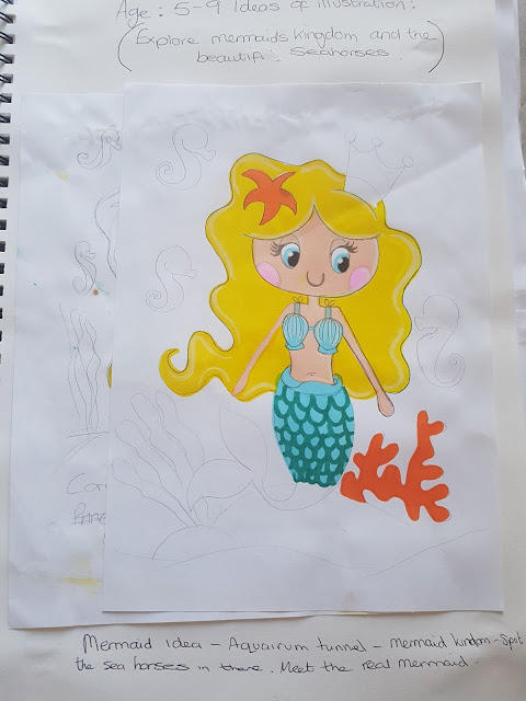
After looking at my ideas I decided that for the children's poster, I want do a mermaid with seahorses around her to advertise the aquarium tunnel. The tunnel will be transformed in to a mermaid underwater kingdom with real seahorses swimming about. This is great for young kids as they love to explore and also the children would be able to meet a real mermaid.

The next one for teenagers, I thought about this long and hard and I looked on the Internet for ideas to attract teenagers to an aquarium. I then decided further that maybe I should not attract them to something in the aquarium, but more something useful to them that they could learn from. I decided to think of creating a club for teenagers that would learn about protecting endangered sea animals and learn how to keep the ocean clean, a bit like brownies or something like that that helps and learns teenagers for the future.
Finally for the adults poster, I want to create an idea that when you're an adult and you have explored and learnt, you now want to achieve things that you are passionate about. I have decided that I will create a poster for deep sea diving, so that adults can dive in the aquarium tanks or in the sea if its near the aquarium, to get closer to the creatures under the sea.
Illustration one for children
Now I know what I wanted to do here which was a mermaid with seahorses in the illustration I will now quickly look at some pictures of mermaids and seahorses to help get my ideas flowing.
Please follow this link below to see my pinterest board for seahorses and mermaids. These are imaged that I found that I can use for research and inspiration:
https://uk.pinterest.com/GemmaMlees/mermaid-and-seahorse/
I now have a better understanding of what I want to achieve in this poster illustration. Next I shall draw up a few ideas of the Mermaid and seahorses and see what I can come up with:

Above I have quickly sketched a mermaid and trying out colouring using pens and fineliners. I thought this made the illustration I was going for a bit too bold and I want something softer so I have decided the next attempt is going to be done using watercolour.


I wanted to try out my club design. I came up with the club name called Ocean squad, which I thought sounded a great name to use for a club that is protecting the ocean and the animals that live there.

I started drawing some animals as such as whales (above) they were coming out well. I particularly like the watercolour ones that I had created. I had in previous sketches come up with the idea of creating a shield with the logo on and the sea creatures surrounding it.
Please follow this link to see my pinterest board for ideas I collected for inspiration:
https://uk.pinterest.com/GemmaMlees/child-aquarium-poster-inspiration/


 Above is a screen print. The illustration is coming together as you can see. I scanned in my images of my animals, filled them in with colour and put a shadows on them which will help make the illustration pop out from the page when the Shield is in front of them.


I attempted to use the water colour and it was going well, but I still was not completely happy with it. I still feel I need to improve and experiment with watercolours to see what other tools I can use to mix with them to help create textures. On the second page above you can see I have actually attempted this using watercolours and pens and colouring pencils on top of the paint. It does look a lot better how I imagined her, but I still felt it needed improvement. The next attempt I wanted to do was the Mermaid using my 3D paper illustration
I started doing my 3D illustration of my mermaid attempt but it ended up being my final illustration as I enjoyed doing it so much and it turned out really well here it is below:

I was really happy with the outcome and during making the mermaid with the Seahorses, Itook a video step by step of how I created it you can watch the video here on the link below this is a great idea that I thought up as at the time that can show and demonstrate how I put my 3D illustrations together.
I think this would make a great poster for children. To create the final poster I think I would have to scan this into the computer and work on and around it to form a poster I am ready now to attempt the teenage illustration.
The teenager illustration
For this illustration I did decided that I wanted to create a club. However I did also have some other ideas in mind which have sketched out into my sketchbook as below:

I like the fact of using an octopus in an illustration. It sounds weird but I actually enjoy drawing octopuses I have done them before and I like how you can create curves and swirls when creating their tentacles. This has actually given me a good idea for my adult illustration.

Please follow this link to see my pinterest board for ideas I collected for inspiration:
https://uk.pinterest.com/GemmaMlees/child-aquarium-poster-inspiration/

I like my final design and I think it will attract teenager well to an exciting adventure club . I have decided that I am going to create this in illustrator and test out my new skills.
First I will draw out my illustrations of animals out on paper with a fine liner. My plan is to scan them in and trace in illustrator each one separately and put the illustration together.


 Above is a screen print. The illustration is coming together as you can see. I scanned in my images of my animals, filled them in with colour and put a shadows on them which will help make the illustration pop out from the page when the Shield is in front of them.
Above this is further into my illustration where I have just finished putting all the animals around the area where the Shield is going to be.
Here below is the final finished idea that I ave designed:

I really like my idea I think it has turned out fantastic . The only issue was that I wanted to edit the colours and add textures on to my creatures but as I have just finished the course on Lynda.com I am a bit unsure here how to do this and need to investigate more to improve this area in Illustrator. Overall I am happy with my illustration, I think it gives a great impact to what the teenage club do and it is bright and clear. I put it on Instagram and I had a lot of likes for it so the viewers enjoyed looking at this too.
Adult illustration
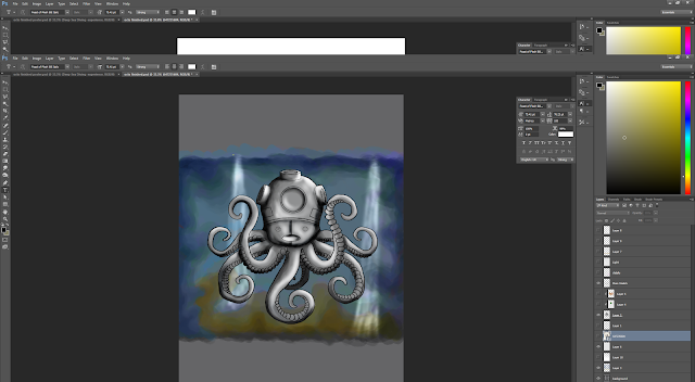
For this one it was my idea of creating a deep sea diver poster to get adults interested in diving and surrounding themselves with the creatures from the Deep.
Please follow this link to see my pinterest board for ideas I collected for inspiration:
Here below are a few of my ideas:


I really liked my idea I came up with with the octopus having a diver's helmet (the old version) on his head it illustrates what I am trying to to advertise to the viewers.
Now that I have decided what I want to do I will sketch this idea and scan it into Photoshop and test out my new skills to come up with a final illustration.
Now that I have decided what I want to do I will sketch this idea and scan it into Photoshop and test out my new skills to come up with a final illustration.
Here below is my rough sketch from my illustration I scanned in I am now going to do a new layer and produce a more detailed sketch which will become my main sketch for the illustration.

Here below is now my main sketch I am really happy with how this is come out and excited to add Shadows highlights and colour to it.

First of all I added a grey background and used different shades of grey to add highlights and lowlights in the area.

I now have to create another new layer and change the mode to colour, so that when I colour on this layer the Shadows and highlights I created just in the grey tones will show through.


After looking at my 3 final illustrations next to each other. I thought about it and decided that what I would like to do is create a poster for the adults deep sea diving illustration. This is due to the fact that I was proud and happy of my outcome using Photoshop and finally understanding what is what on the programme to help me create digital illustrations better. I also thought it is a great advertisement to adults and I have a vision of how my poster will look once I have finished.


Here is my finished background. I added in some highlights and some other colours. Next I need to colour in the octopus. To help me I have to use the marquee polygon tool to select around the octopus on a new layer and filled that in with a lighter grey then the one I used on the background. This is now my lawyer for adding Shadows and highlights to the octopus.

Above- My octopus finished with the colours and finally I now have to tweak the illustration and add some details to make it have more character and perhaps a foreground to add depth.


Finally, above is my final illustration. I am really thrilled about how it has came out and my learning of Photoshop really shows here that I have improved. I like how I added in the beams of light from the top of the sea from the sun, it gives it a great underwater atmosphere feeling. This is also helped by the bubbles surrounding the octopus it really stands out and is attractive.
The Poster
Here below is how I created my poster:

Above image I inserted my final illustration and decided that the background was going to be dark blue to start.

In my vision I wanted the octopus to look as though he is deep in the sea and thought of the viewer looking at him from a dark cave. This will help the poster by creating depth which will again help emphasize the deep sea part of my illustration. I created a new layer and changed the occupacity of my paintbrush and used the blue to paint over the edges of the illustration to get rid of squareness of the image and create a rocky tunnel effect.
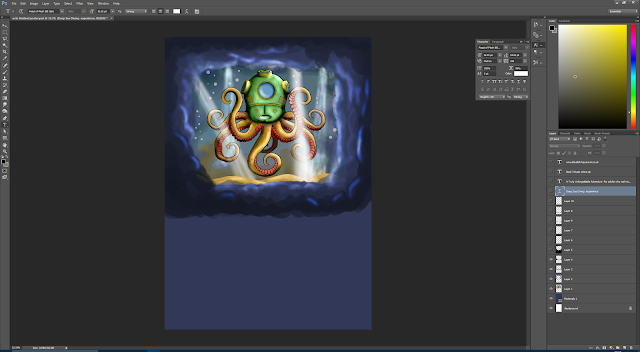
I also created two more layers of rocks, but with more darker paint to create even more depth into the illustration.

Finally I added another layer. I used black which is the darkest Shadows of the tunnel and added subtle pink with a lower occupancy to highlight some of the Rocky areas you would just about see from the light reflecting.

Once happy with the illustration I attempted the text and font type. For the header I found a font which was a scarey type. I looked for underwater font and melting fonts but I thought this scarey one looked more appropriate and what I had in mind to compliment the illustration well. It's really exciting to see how my illustration now pops out even more from the poster and makes the viewers look in to it. It gives a great atmosphere effect of being deep underwater .
I then decided something was missing where the header was I felt that it needed to stand out more.


I then decided something was missing where the header was I felt that it needed to stand out more.
I decided to use yellow paint using a lower capacity to create a glowing effect around the text I didnt want to use the glow tool as I wanted to you make the glow look a bit Rocky to go with the tunnel, a reflection from the font.


Here below is my final poster for this exercise:

I really enjoyed this exercise, which I knew I would at the start. I love experimenting and that moment where you see something is going somewhere is really exciting. I did enjoy creating all three illustrations but I decided on this one in the end again, as I am new to Photoshop and this was a great achievement for me to create something like this to use as a poster. I think I have got all the information on their needed for that age group. I also added a Aquariums logo which I quickly made up.
I think the way I have captured the depth by using layers of rockery works really well and the beams of light really help it work well. I am really chuffed with this illustration and looking forward to do more with photoshop. I did feel a little uncertain about illustrator but I will have a look on lynda.com to see how I can pursue further with illustrator and find out more ways to add different textures and colours and ways of doing illustrations in that program.
The 3D mermaid came out really well too and I was happy that this would suit a children's poster. Next time if I attempted the child's one again I will try and make a unisex poster to attract both girl and boys.


